The Lendx landing page is a modern, responsive website designed for a fictional fintech product, enabling users to explore loan options and submit applications seamlessly.
The page features a clean header with navigation, a hero section with a validated loan application form, four trust-building content sections (Trusted Partners, How It Works, Testimonials, FAQ), a dynamic countdown timer (targeting Midsummer Eve or New Year’s Eve 2025), and a footer with contact details and social media links.
The design prioritizes user trust, clarity, and engagement, using a professional color scheme and intuitive layout to encourage loan applications.
Live Website
- Designed and developed in 2-3 days.
- View the live website 🌐
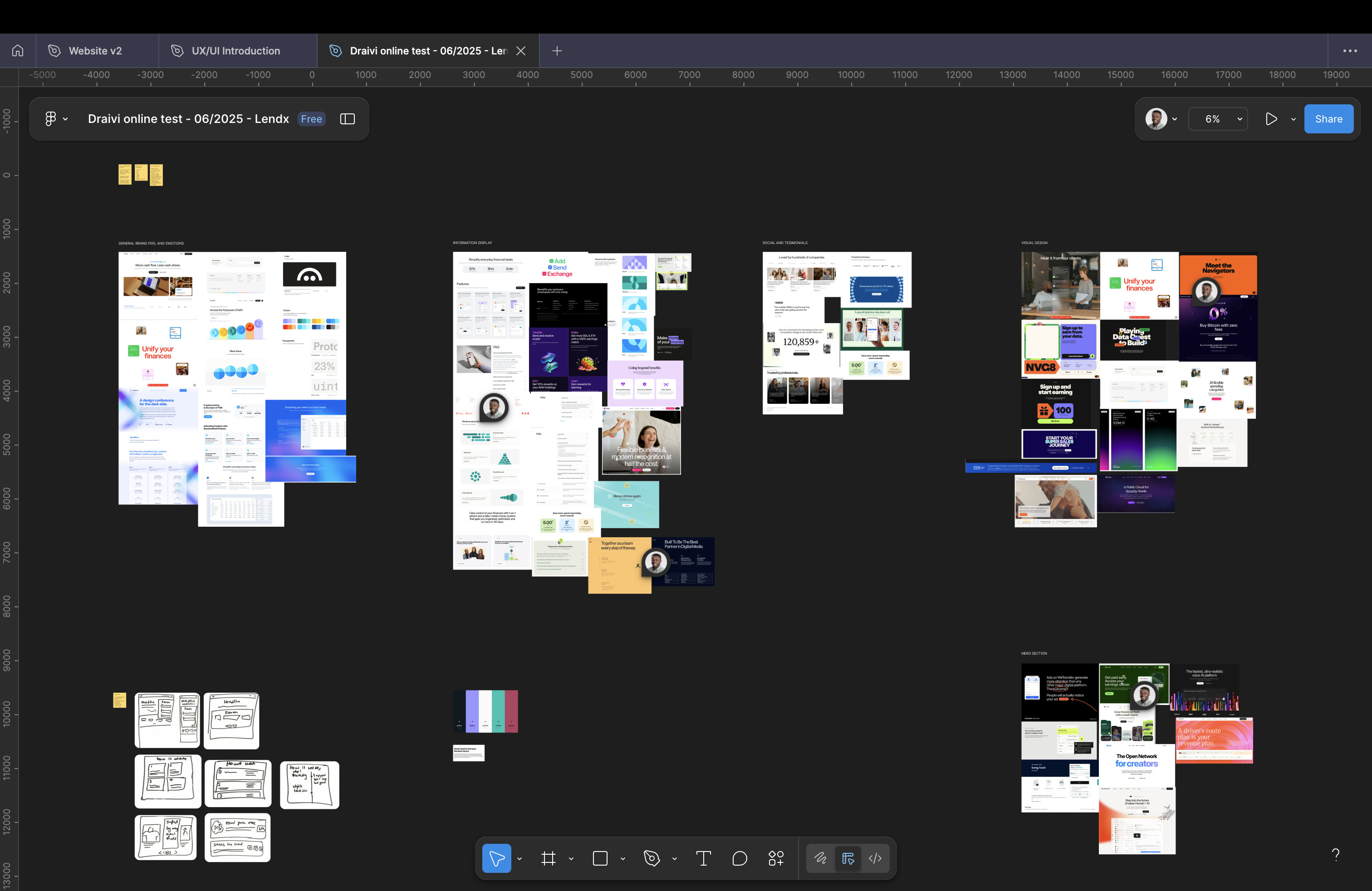
Moodboarding
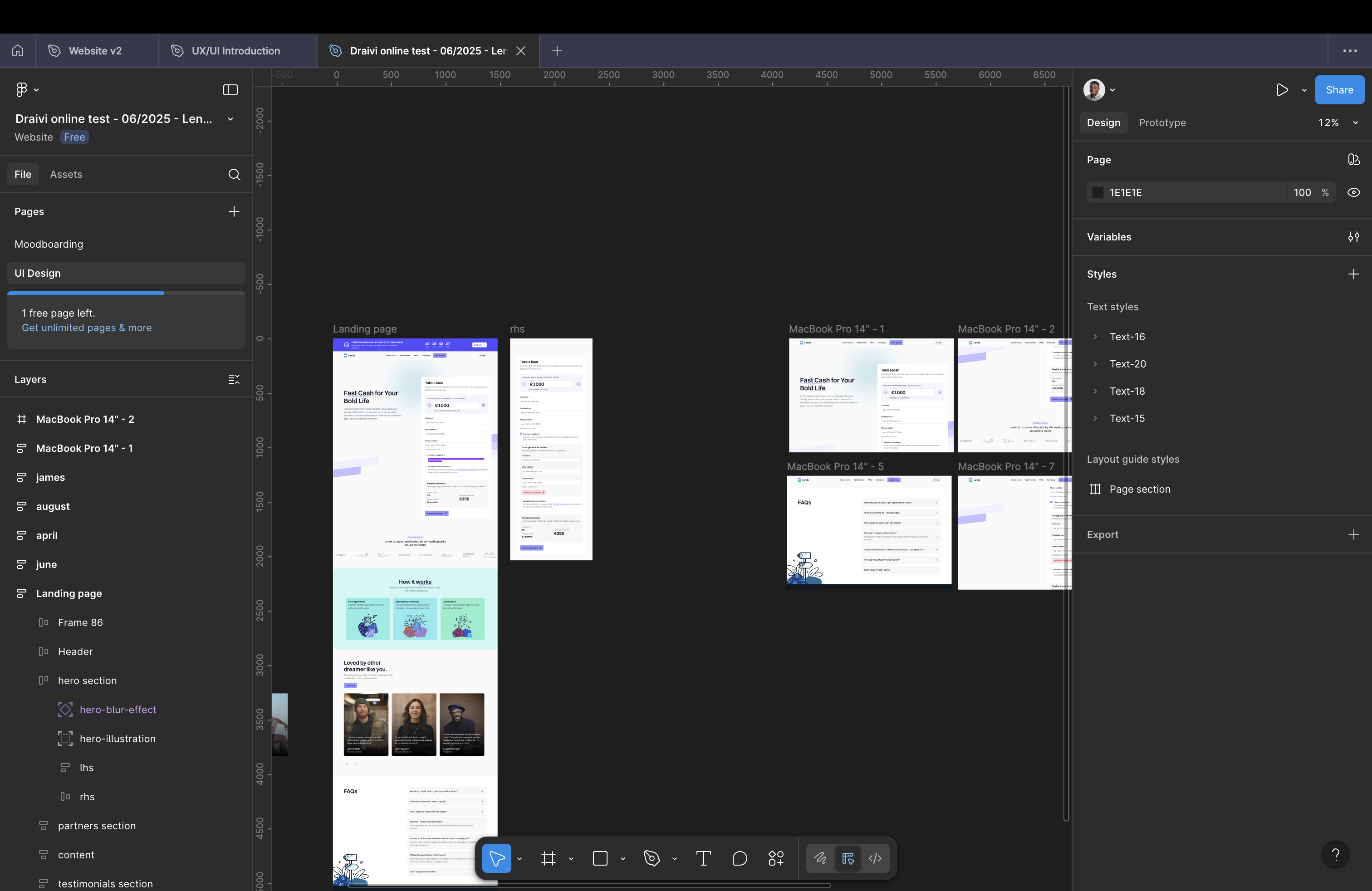
Figma UI Design
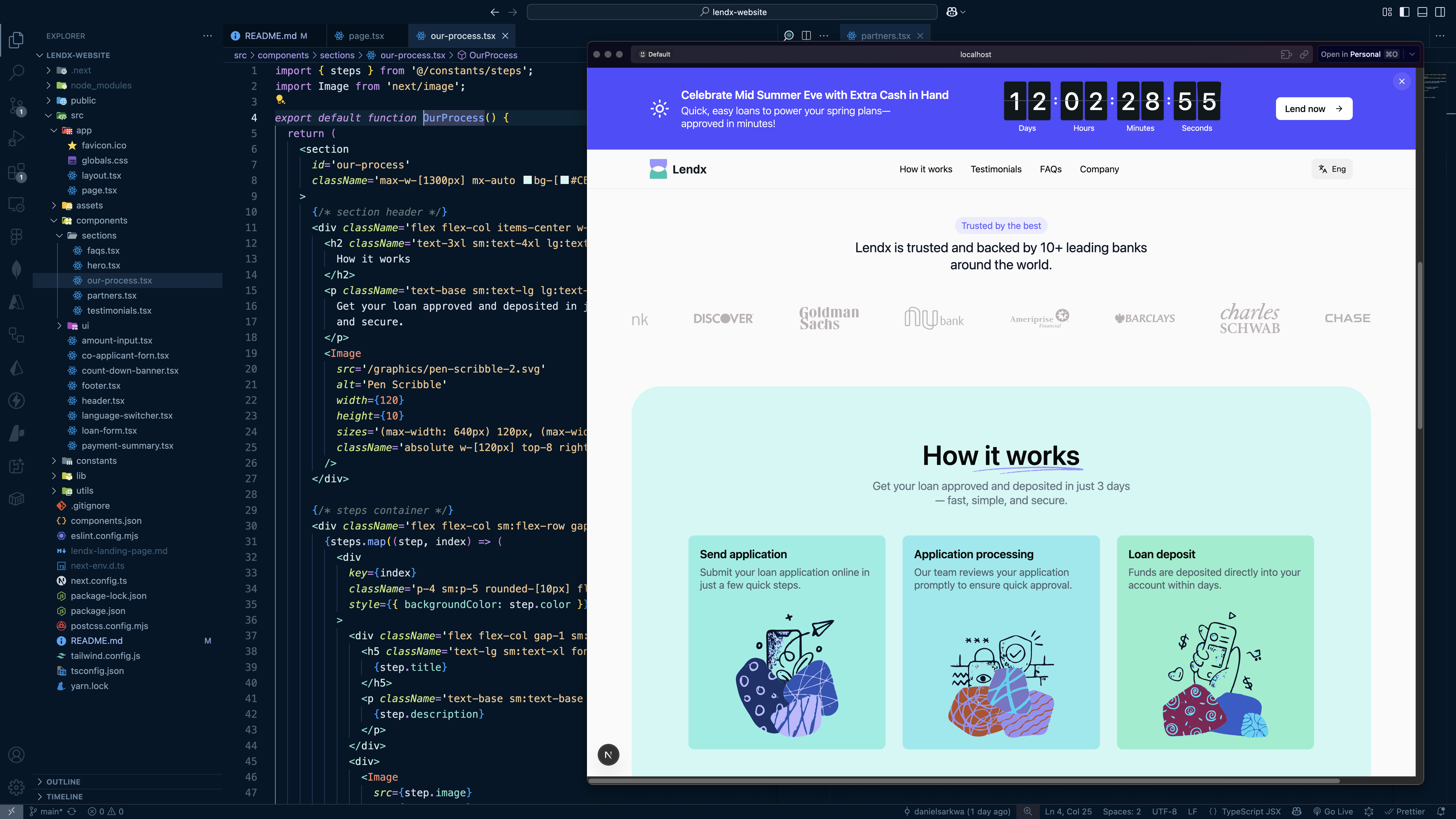
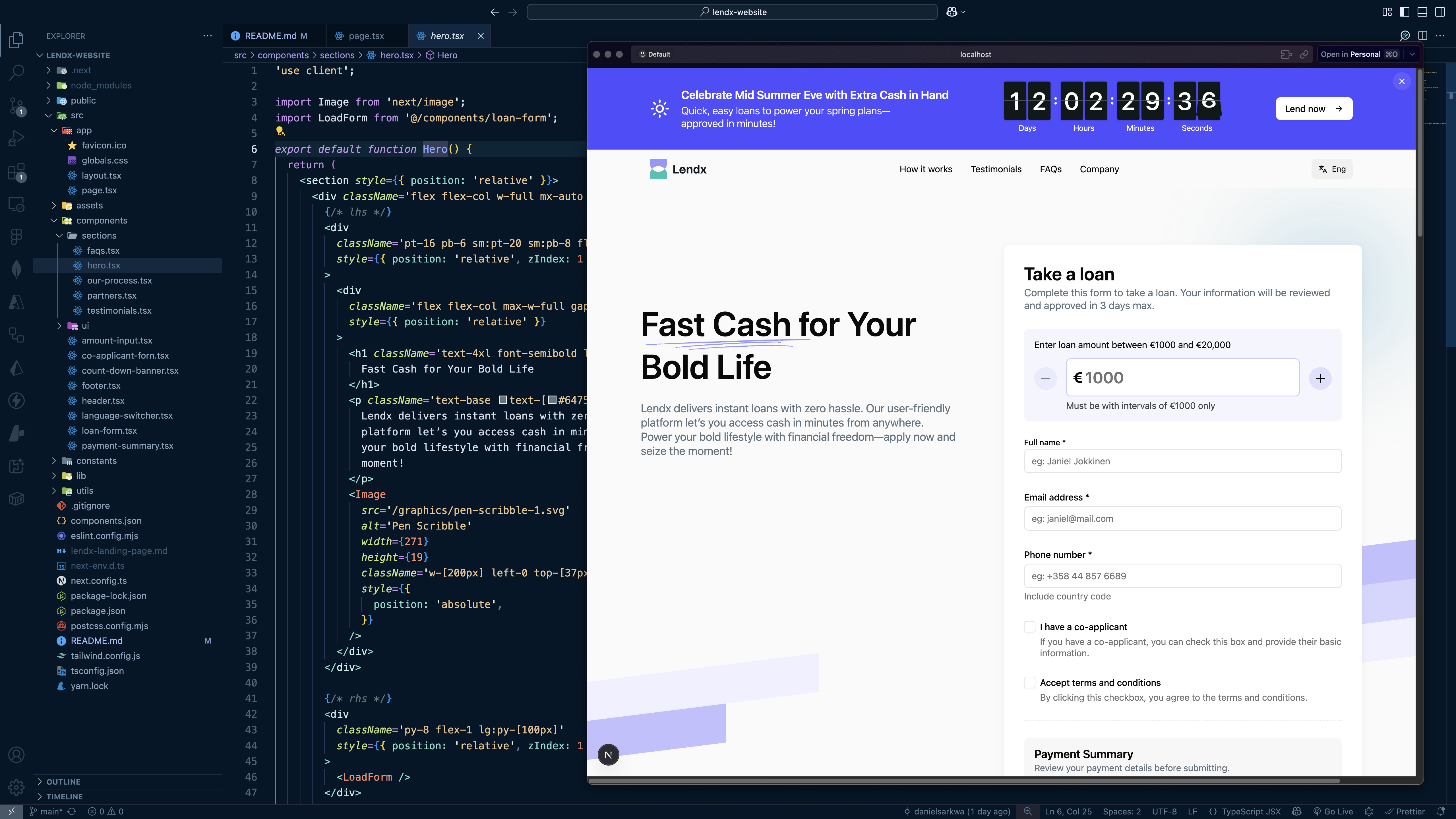
React / Next.js live coding
Responsibilities
- Defined the target audience and clarified the landing page goals.
- Created wireframe sketches and prototype in Figma to design a responsive, user-centered layout.
- Developed the landing page using Next.js and React.js, ensuring fast, responsive and SEO-friendly rendering.
- Implemented form validation and a dynamic countdown timer using JavaScript.
- Styled the page with Tailwind CSS, integrated Shadcn components, and added Framer Motion animations for a responsive, accessible, and engaging user interface
- Deployed the application on Vercel for reliable hosting and scalability.
- Tested the page for functionality, responsiveness, and accessibility across devices.
Year
2025
Tools
Figma, Next.js, React.js, JavaScript, Tailwind CSS, Shadcn, Framer Motion
Design Objectives
- Design a modern fintech landing page with a professional and approachable look.
- Implement a fully functional loan calculator and form validation using JavaScript.
- Include dynamic UI elements, such as a countdown timer that adapts to URL parameters.
- Ensure a responsive layout that works seamlessly across devices.
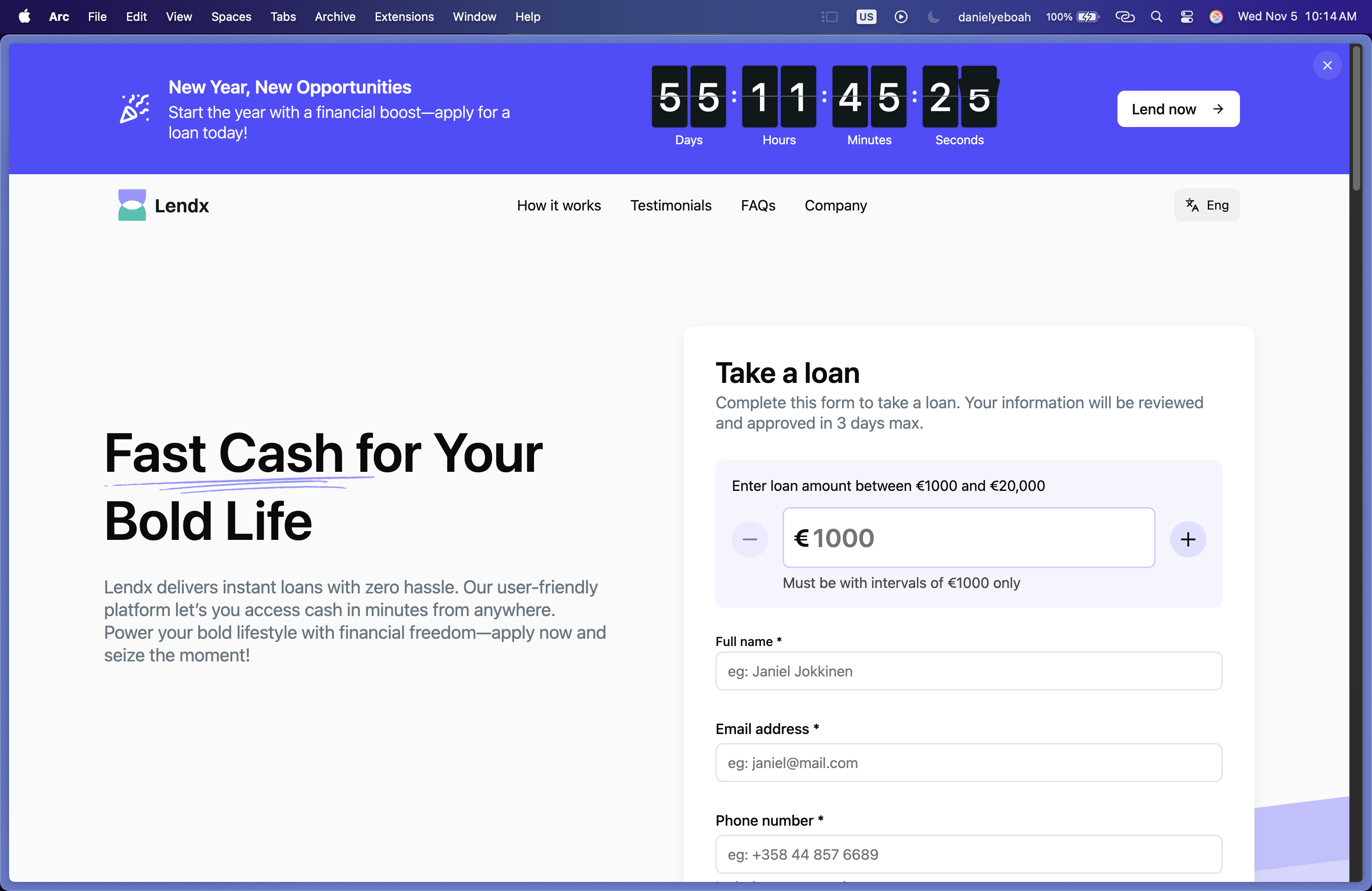
Header & Hero Section
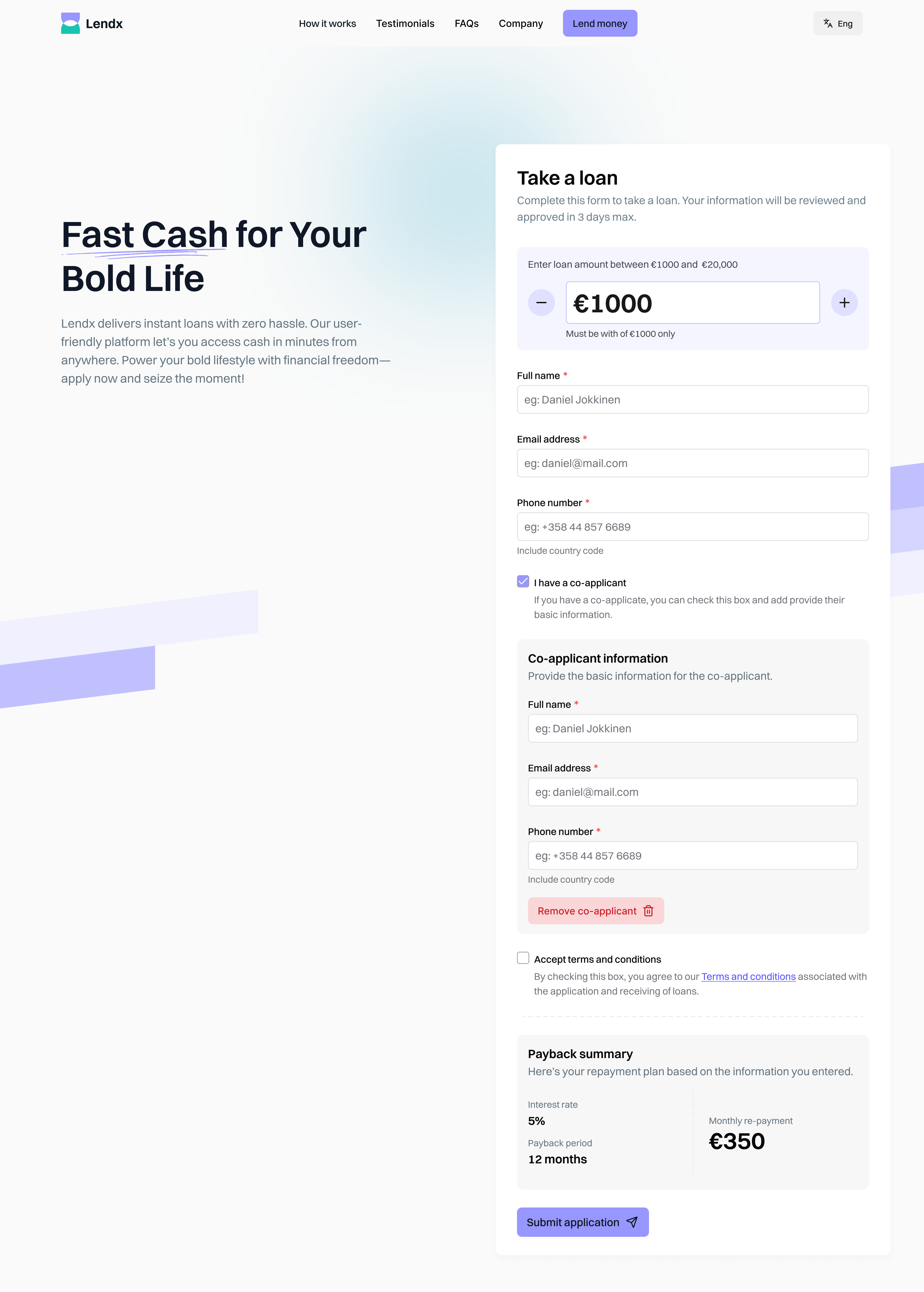
- The loan amount input is placed prominently to capture attention and initiate user action early, following the Hook Model principle for engagement.
- Increment/decrement buttons ensure precision and usability, aligning with Nielsen’s Flexibility and Efficiency of Use heuristic.
- Helper texts in form fields guide users and reduce input errors, enhancing accessibility and aligning with usability heuristics for Error Prevention.
- Real-time field validation ensures users receive timely feedback without frustration, creating a seamless experience.
- Simplified error recovery with auto-rounding minimizes user correction effort and maintains data consistency.
Trusted Partners
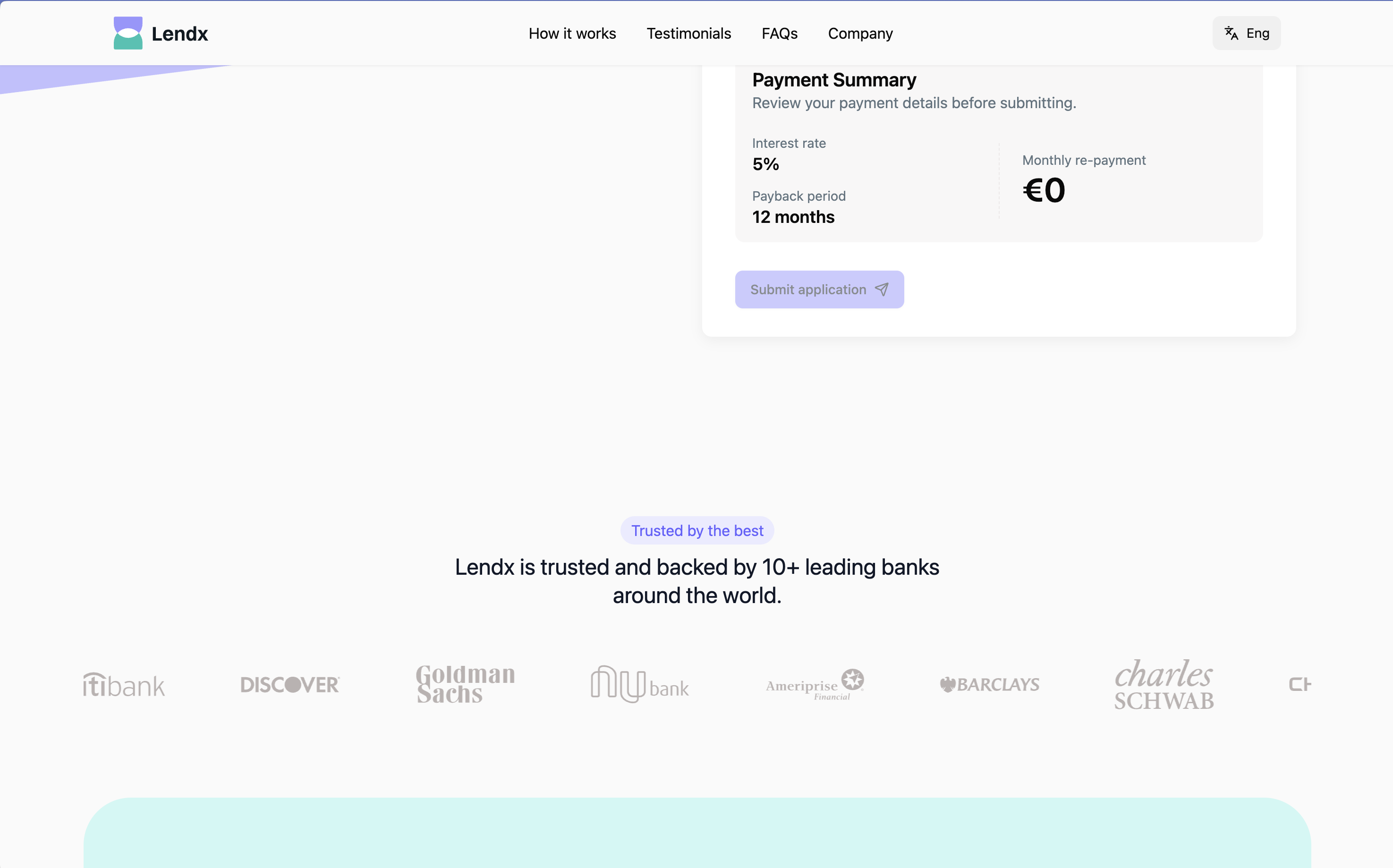
This section reinforces brand trust by showcasing logos of reputable financial institutions that hypothetically support Lendx, signaling credibility and safety to users exploring loans.
The inclusion of partner logos strategically builds trust at an early stage in the page, reducing user hesitation and enhancing the perception of legitimacy, a crucial factor in fintech environments.
How It Works
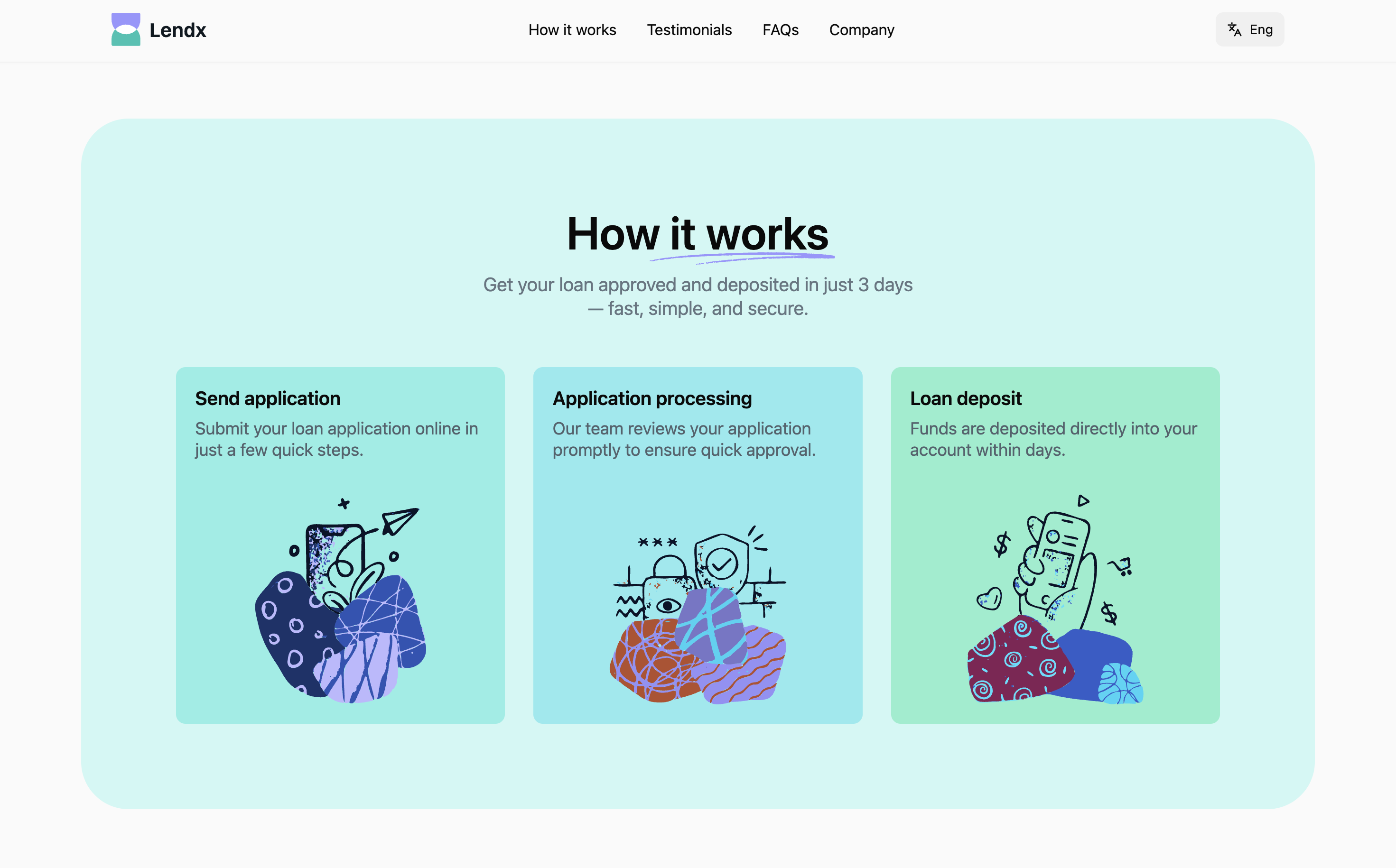
This section explains the loan process in three simple, visually guided steps:
- Submit an online application.
- The application is reviewed and approved.
- The loan is deposited directly into the applicant’s account.
The three-step visual layout uses progressive disclosure to simplify a complex financial process, reducing cognitive load. The illustrations and brief copy help users quickly understand the workflow, fostering clarity and confidence.
Testimonials
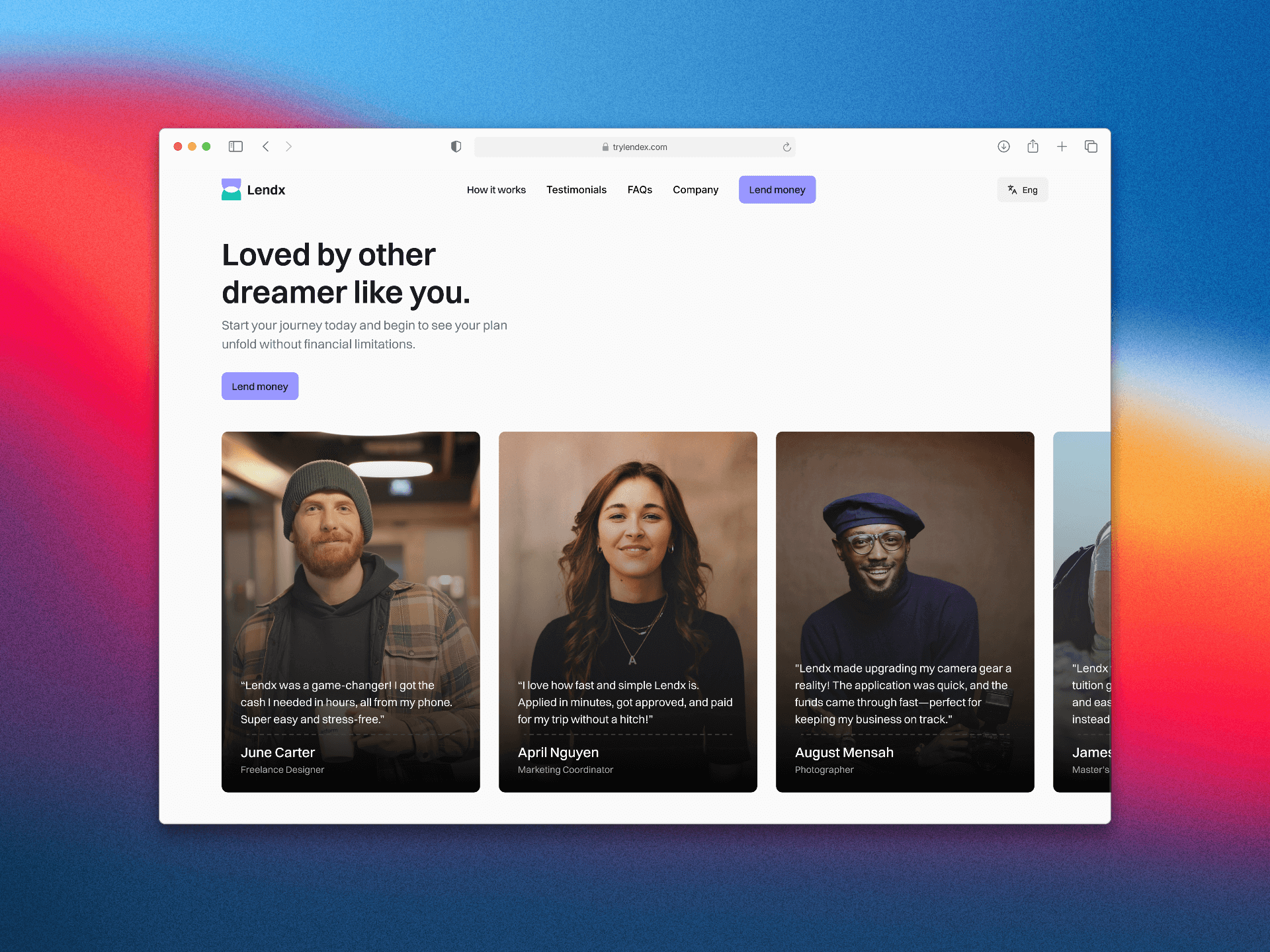
The testimonial carousel provides social proof through real-world scenarios and imagery, showing diverse users who benefited from the service. This section humanizes the brand and enhances emotional engagement.
Using authentic photography and relatable testimonials builds credibility and leverages social validation to influence decision-making, a proven psychological driver for trust-based conversion.
FAQs
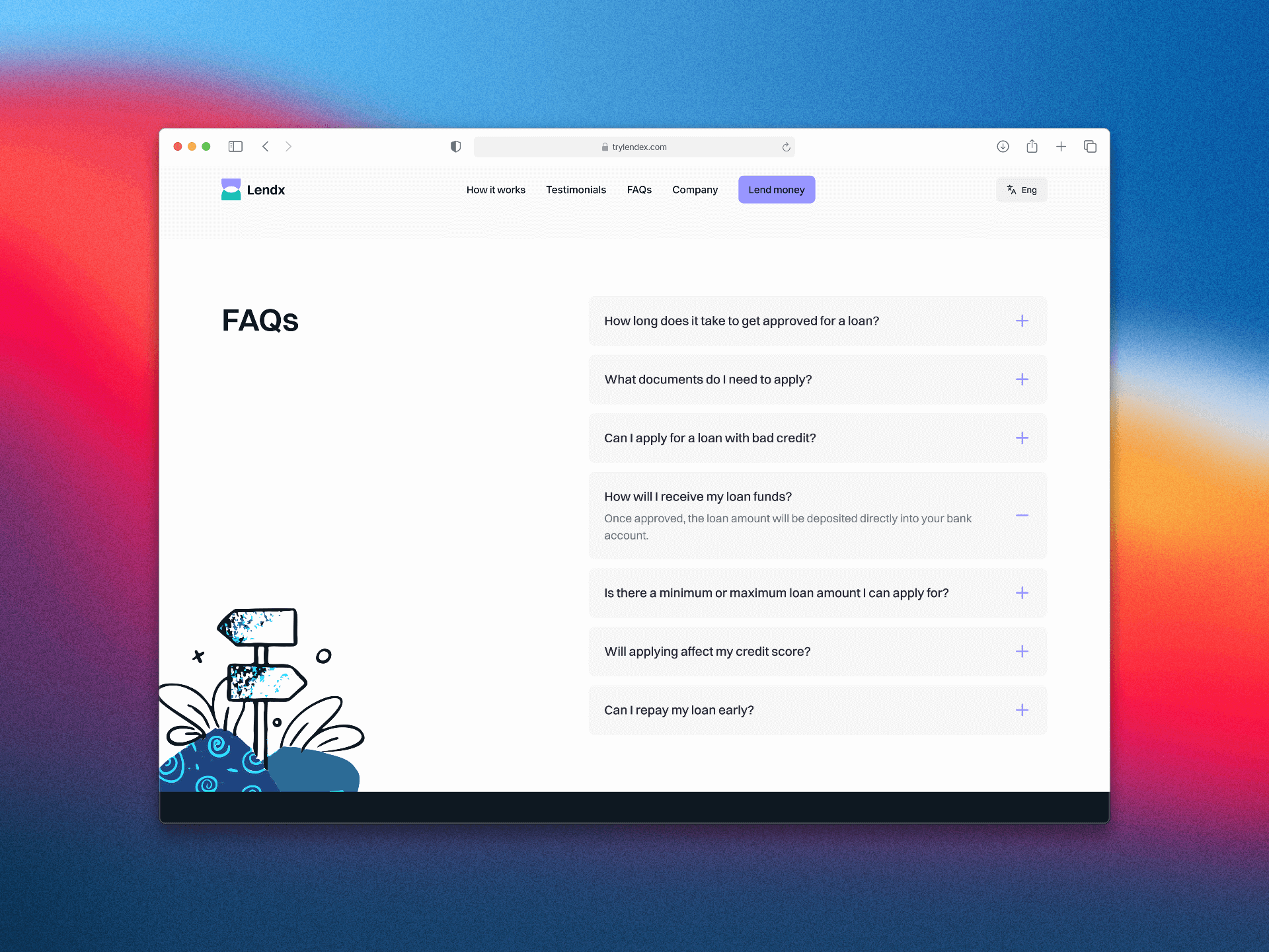
An accordion-style FAQ section addresses user concerns in a compact, organized format. Each question expands to reveal detailed, concise answers.
The accordion interaction supports progressive disclosure, helping maintain a clean layout while enabling users to access relevant information on demand. This aligns with usability best practices for information hierarchy and readability.
Dynamic Countdown Timer
The countdown banner creates urgency, encouraging timely action by displaying a real-time countdown toward an event (Midsummer Eve or New Year’s Eve 2025), dynamically selected based on the URL parameter.
A JavaScript-powered countdown element that dynamically updates based on URL parameters.
- Default target: Midsummer Eve (June 20, 2025)
- Alternate target: New Year’s Eve (December 31, 2025) if
?counter=newyearis present in the URL.
The countdown uses a psychological trigger of scarcity and urgency to drive conversions. Its dynamic behavior demonstrates technical adaptability and flexibility for future marketing campaigns.
Footer
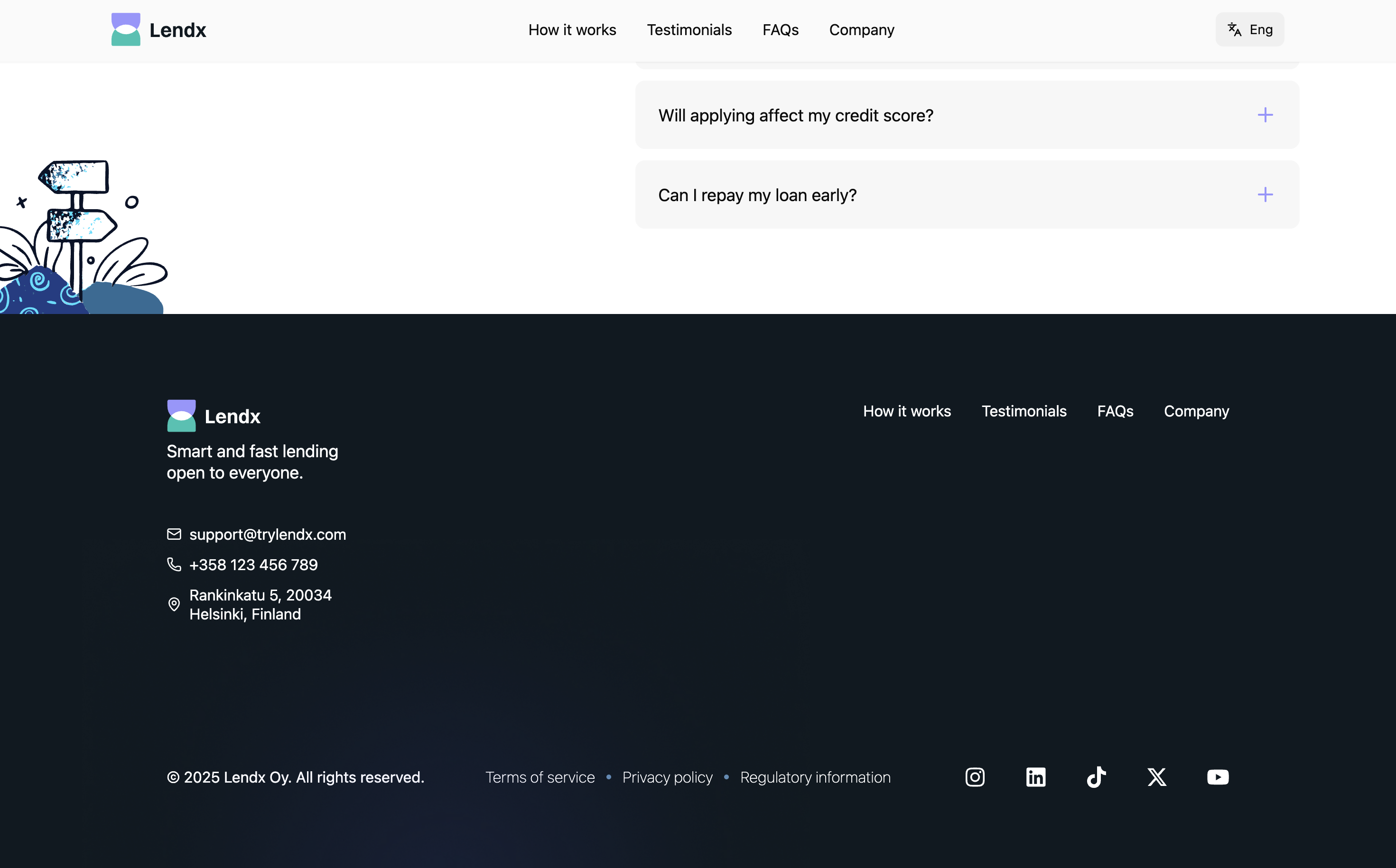
The footer provides company contact details, navigation links, and social media placeholders, maintaining consistency in visual hierarchy and ensuring accessibility.
The footer consolidates essential information in a predictable location, aligning with web conventions for user familiarity and quick access to support and legal resources.
Design and Technical Decisions
-
Next.js as the Framework: I chose Next.js for its built-in optimizations, such as server-side rendering and static site generation, which enhance website performance and SEO. Its flexibility supports diverse resources, enabling scalable and efficient development.
-
Tailwind CSS and shadcn/ui for Styling and Components: I utilized Tailwind CSS for its utility-first approach, enabling rapid and responsive styling with minimal custom CSS. Combined with shadcn/ui, a component library built on Tailwind, I ensured a consistent, accessible, and customizable UI design, streamlining development while maintaining a modern, cohesive aesthetic.
-
Helper Texts for Form Fields: Helper texts guide users and reduce errors, following Nielsen’s usability heuristics for Error Prevention and Help and Documentation. This improves clarity and enhances the form’s approachability.
-
Prominent Loan Amount Input: Placing the loan input at the top of the form encourages engagement, following the Hook Model, and improves completion rates by prompting early interaction.
-
Increment/Decrement Buttons: These buttons enhance usability for experienced users familiar with similar UI patterns and enforce valid intervals, supporting both Flexibility and Efficiency of Use and Error Prevention.
-
Flexible Input with User Control: While the buttons constrain valid inputs, manual entry is still supported, balancing structure and user freedom as per the User Control and Freedom heuristic.
-
Simplified Error Recovery: Automatic rounding of invalid inputs reduces correction effort and maintains data consistency.
-
Clear Error Messaging:
Concise, actionable error messages provide quick feedback, improving usability and reducing frustration. -
Real-Time Field Validation: Field-by-field validation ensures that feedback is timely but not overwhelming, promoting smoother user interactions.
-
Countdown Banner for Urgency: The dynamic countdown creates urgency, boosting user motivation to act while maintaining transparency.
-
Progressive Disclosure for Co-Applicant Form: Progressive revelation keeps the form uncluttered and focused, improving flow and reducing cognitive overload.
Future Potential Improvements
- Customizable Countdown Banner: Allow administrators to update banner text dynamically for events or promotions.
- Smart Countdown Triggers: Automate countdown visibility based on event proximity (e.g., 60 days before New Year).
- User Portal for Application Tracking: Enable users to monitor their loan status and document submissions.
- A/B Testing for Hero Section: Test variations in layout, imagery, and CTAs to optimize conversion rates through data insights.