Built™ is an online accounting software designed to help businesses manage their financial activities with ease. It provides tools to track cash flow, monitor expenses, manage inventory, process customer payments, generate real-time reports, and handle staff payroll efficiently.
Responsibilities
User research, personas, prototyping, high-fidelity designing, design system.
Year
2020-2021
Tools
Figma, Whimsical
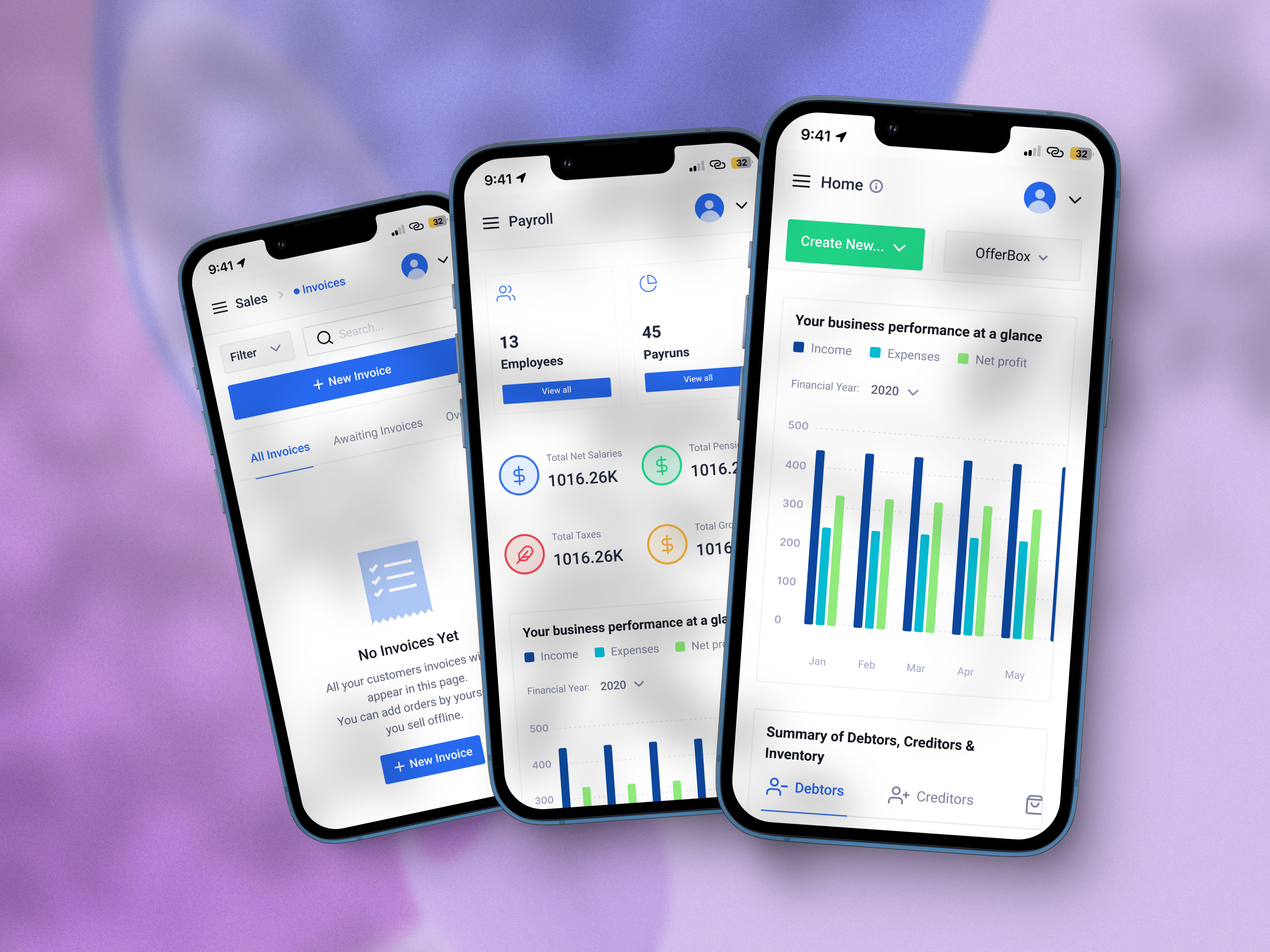
Project context and challenge
Built™ serves a diverse user base with varying use cases and goals. Users range from novices in accounting and bookkeeping to experienced professionals, necessitating different approaches to understanding and interacting with the software. The primary design goal is to ensure that Built remains understandable, useful, and flexible for all users, regardless of their skill level. This involves creating an interface and experience that allows users to efficiently manage their business in a way that feels intuitive and adaptable to their unique needs.
Solution
We began by researching the problem that Built™ aims to solve. Through this research, we gained valuable insights that informed our re-design strategy. We established design principles and created a comprehensive inventory of all the existing features and user flows.
With this foundation, we designed a new interface that supports users of all experience levels. For novices, the application is easy to understand, with immediate feedback mechanisms providing clear and precise responses to their actions. We also abstracted certain levels of complexity to operate behind the interface, allowing beginners to work faster with less friction.
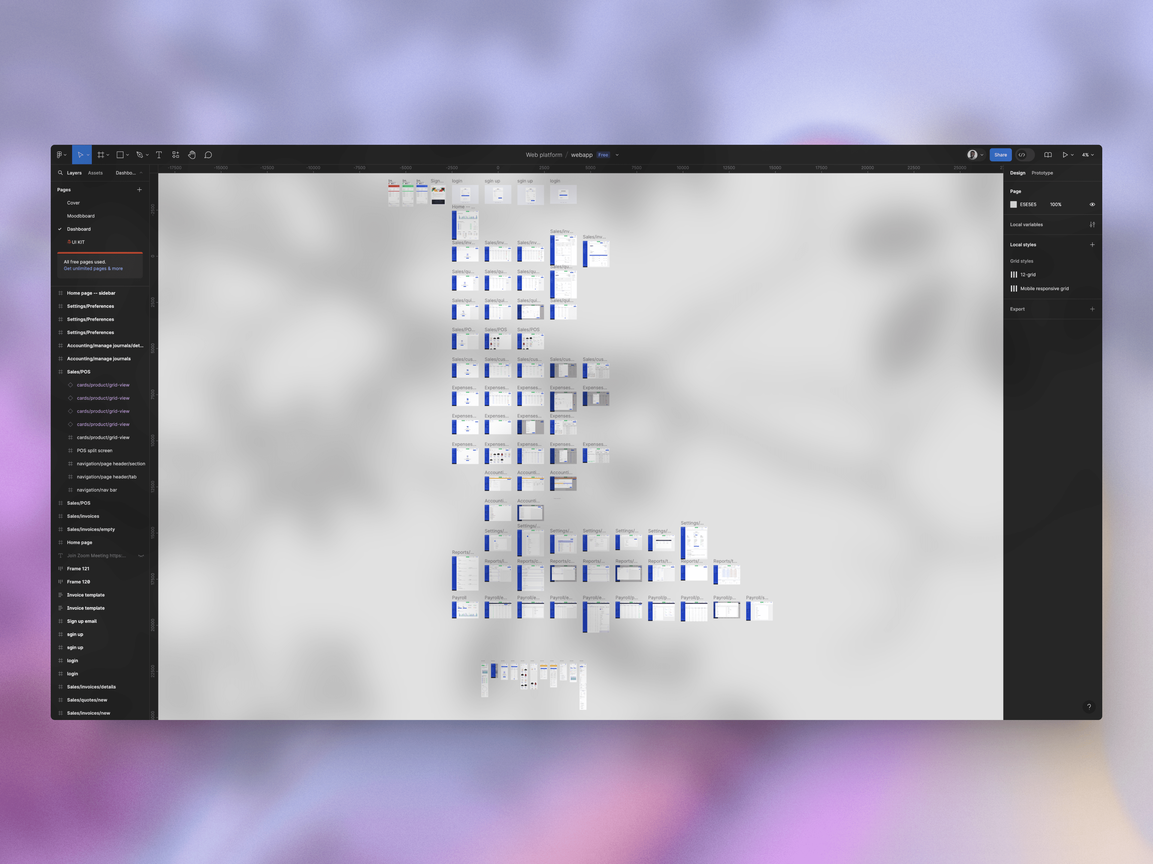
Our efforts culminated in the creation of over 90+ screens for the software, significantly reorganizing and enhancing the user experience. The goal was to develop an ideal design solution centered on empathy, usability, and the discovery of new product opportunities, which was made possible by using an evolving re-design strategy.
Scope of Work
The project was span across different aspects of UX design, each with a focus and a clear problem it’s addressing.
- User Research:
- Focus: Personas, Empathy maps, UX strategy (design & business goals), User insight, Design opportunities & KPIs
- Problem Addressed: Understanding the diverse user base, their goals, and challenges to align the design with real user needs and business objectives.
- Ideation:
- Focus: User flow diagrams, Wireframing, UX architecture
- Problem Addressed: Structuring and optimizing the user journey to reduce friction and enhance overall usability for users at different skill levels.
- Visual / Interface Design:
- Focus: Color scheme, Typography, Iconography, UI library, Desktop dashboard UI, Responsive dashboard UI
- Problem Addressed: Creating a visually cohesive and intuitive interface that supports clarity, accessibility, and consistency across devices.
Research and insight
Our research phase started with defining clear goals for business and users. We started off by having an internal discussion about the submitted feedback of the users and what the major frustrations of the users are.
The research also included joining customer interview calls with key partners and watching screen recordings of how users perform specific tasks.
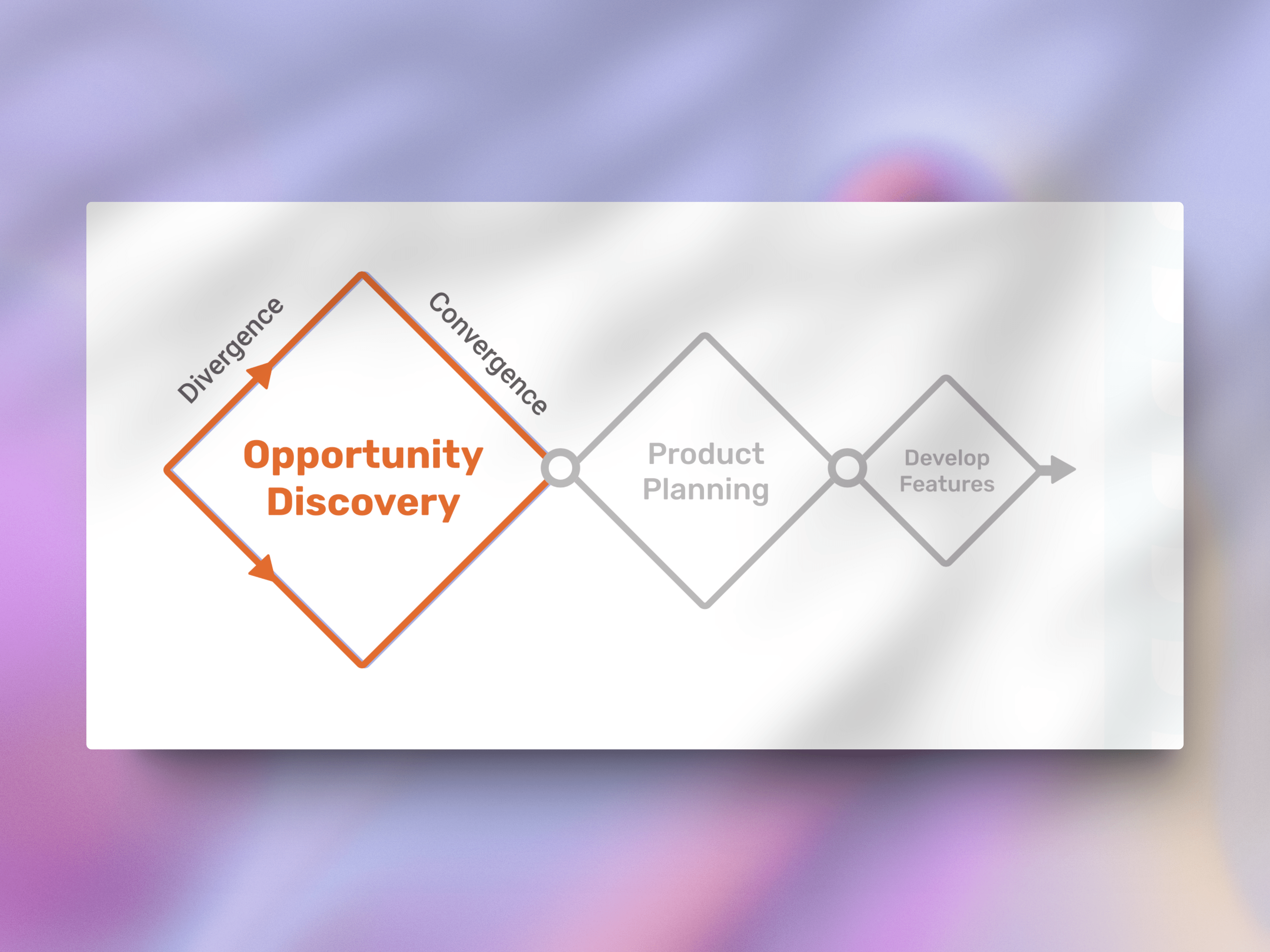
The entire process was intentionally divergent, ensuring that we captured every possible relevant problem that needed addressing. This approach allowed us to better plan the most effective solutions.
The research helped us to:
- Gain a deep understanding of the users' challenges and behaviors.
- Identify areas of the user experience that could be improved or optimized.
- Prioritize design opportunities based on user needs and business goals.
- Set measurable KPIs for the redesign process.
Understanding the why and defining the audience
Before diving into the design process, it was crucial to first understand why we’re solving this problem and who we’re solving it for. By defining the audience, we could align the product vision with user needs and business goals.
We conducted user research to uncover the motivations, pain points, and behaviors of different user segments. This included analyzing existing user feedback, reviewing usage data, and engaging directly with users through interviews and observation.
The why for the project during the research moved from just being a simple redesign for a clean interface to a redesign that solved specific problems for users. User’s with different experience levels in account needed a tool that is simple to use and has reduced complexity, and experienced users needed a tool with better interface consistency to do their work faster.
Understanding the "why" behind user actions provided us with the insights needed to define clear personas and user groups, helping guide design decisions that are truly user-centric.
With a clearer picture of our audience, we were able to create a solution that meets the diverse needs of both novice and advanced users while keeping the overall business objectives in focus.
Personas
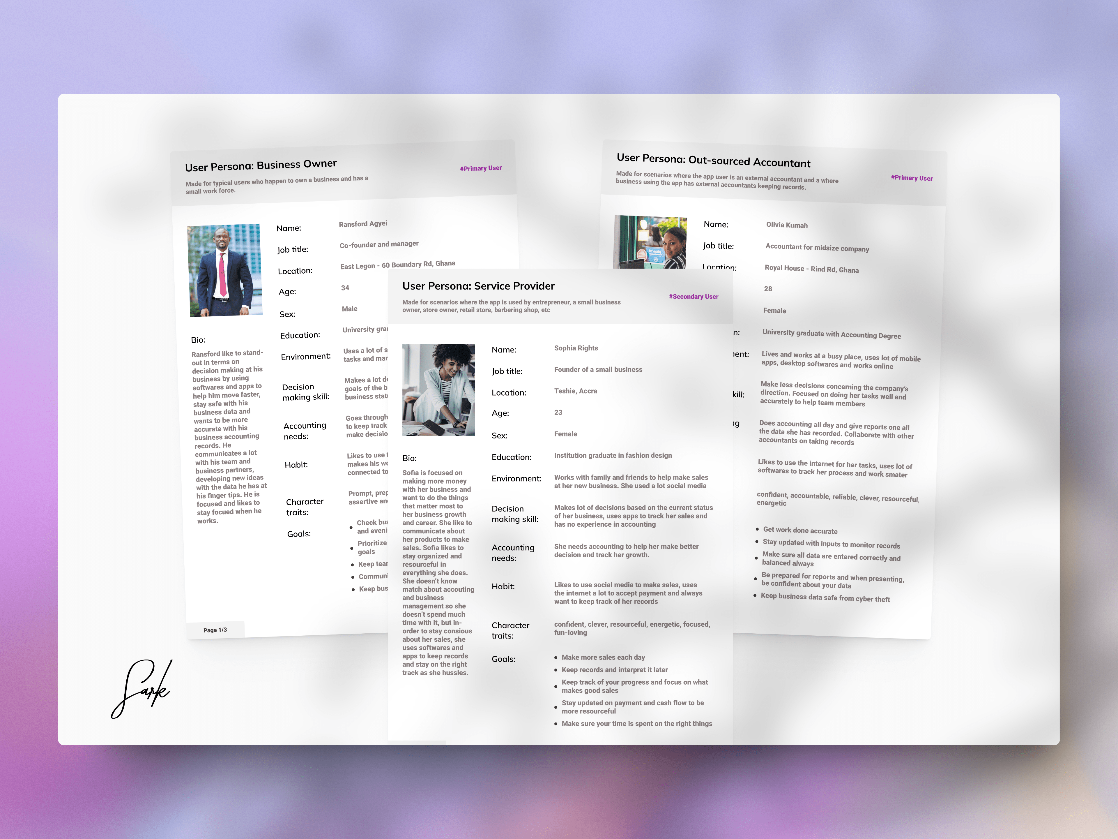
Built™ serves two primary user groups—professional accountants and business owners—along with a secondary user group consisting of service providers. Each of these users has distinct goals, workflows, and levels of expertise. The challenge was to design a seamless experience that caters to the diverse needs of all three groups, balancing simplicity for novices with the robust features demanded by professionals.
Our design approach needed to accommodate varying levels of accounting knowledge, ensuring that business owners and service providers can easily navigate and perform essential tasks without feeling overwhelmed. At the same time, the interface had to be sophisticated enough to meet the complex requirements of accountants, who rely on detailed data and precise controls.
By focusing on flexibility and usability, we aimed to create a product that offers intuitive and efficient interactions for all users, whether they’re managing day-to-day tasks or diving deep into advanced financial analysis. This meant building a user experience that adapts to each role while maintaining consistency and clarity across the board.
Understand the customer's context and needs (When and Where)
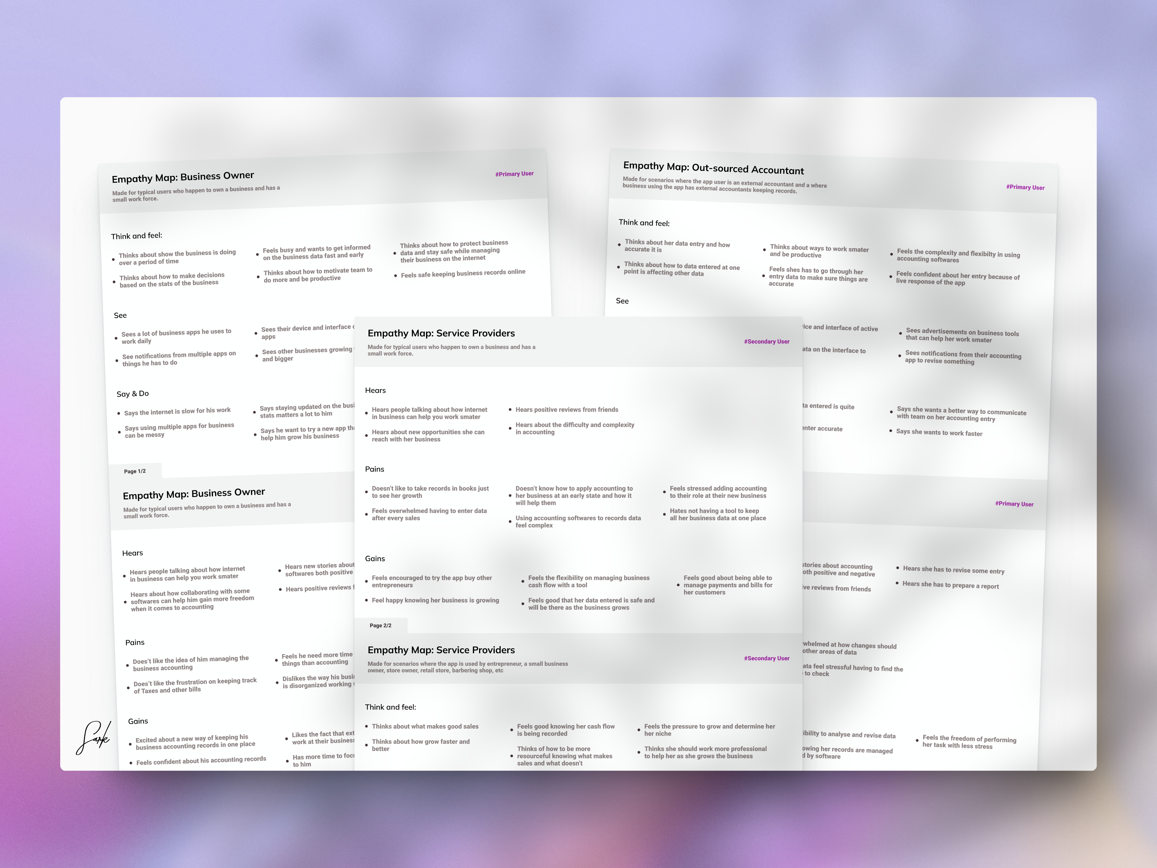
To design a solution that truly meets user expectations, we needed to deeply understand when and where users interact with the product. This involved exploring the various scenarios and environments in which customers engage with Built™, whether they’re busy business owners managing finances on-the-go or accountants working in a structured office setting.
By analyzing the context of use, we identified key moments when users require the most support, such as during tax season, while generating invoices, or tracking cash flow in real-time. We also considered the devices and platforms they rely on—desktop for detailed tasks and mobile for quick checks and updates—ensuring our design adapts seamlessly across different touch-points.
Understanding the customer’s context allowed us to shape the user experience around their actual needs, ensuring the product delivers value precisely when and where it’s most needed.
List ideas (What)
Updated the user flow:
Simplified and streamlined the user journey to reduce friction and make navigation intuitive for all user types. We started by visualizing the current user flow of the application to understand what the process and steps looks like when a user is completing specific tasks.
We uncovered many truths about the complexity and robustness of the user flow.
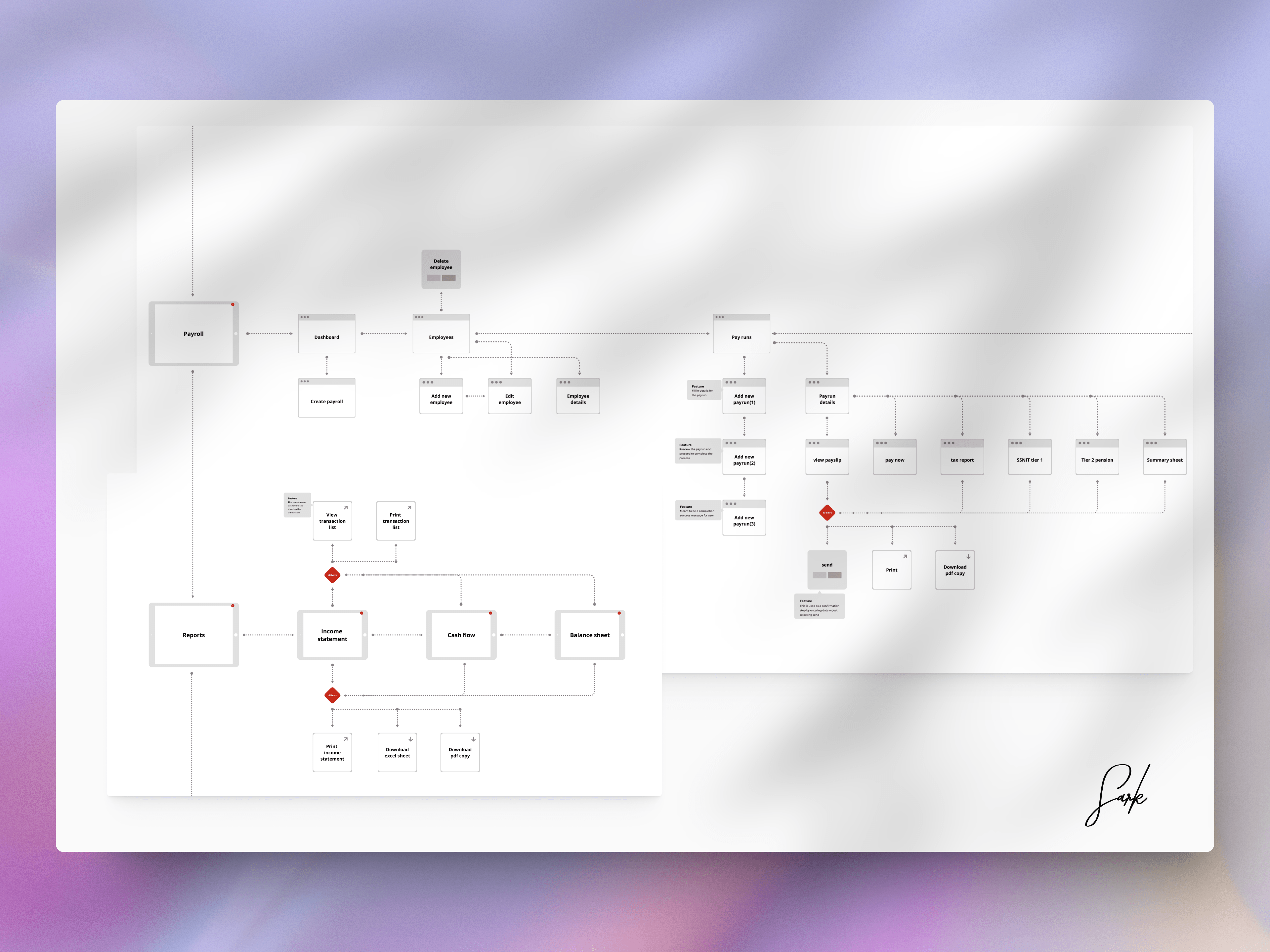
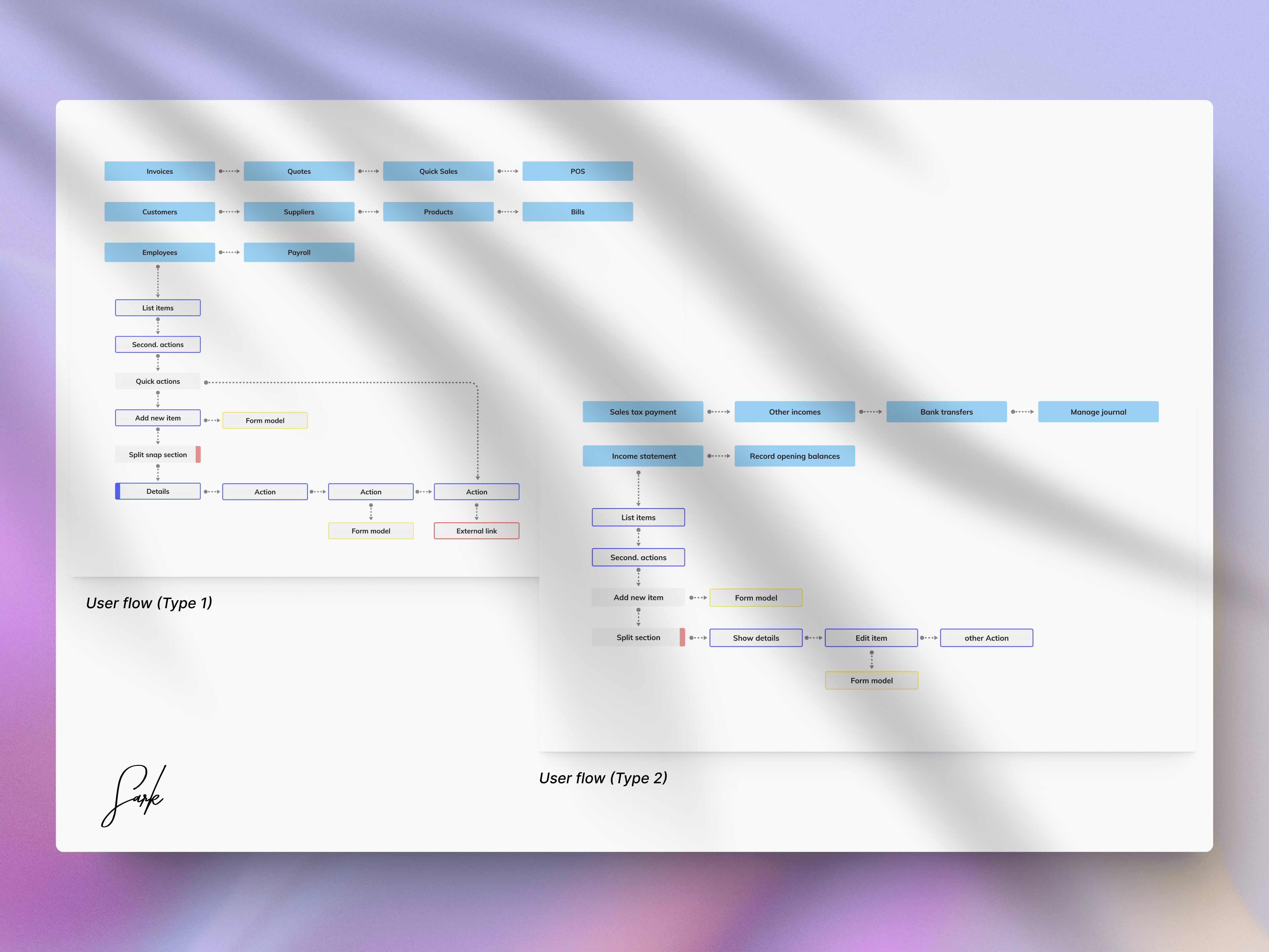
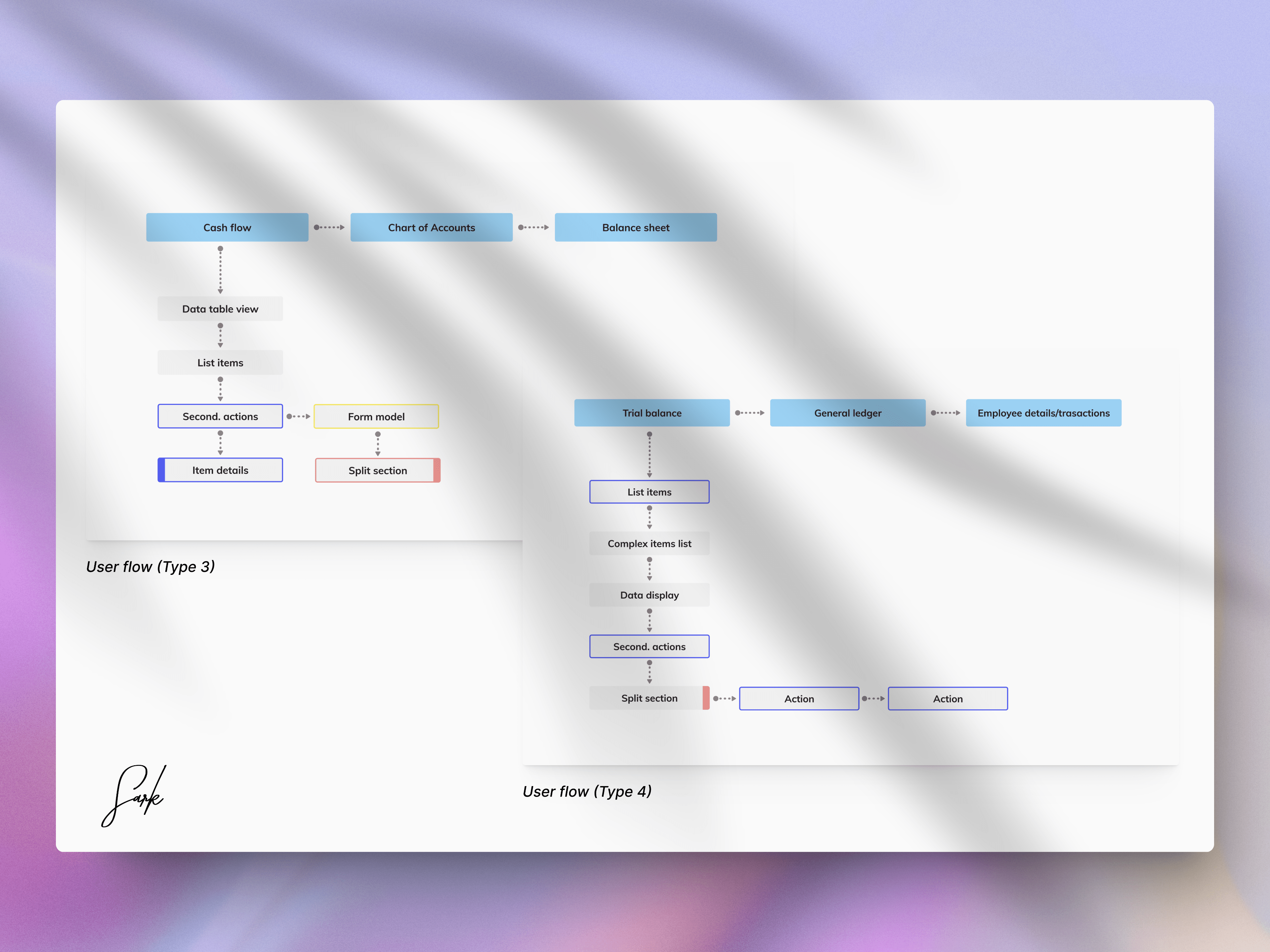
The goal of visualizing the user flow was to discover patterns in the user flow and find a good way to simplify it as we didn’t want tot design a completely new user flow that may be unfamiliar with the current users.
We identified four (4) main user flow patterns that consistently emerged across the feature set offered by Built™ and we designed four new patterns from it.
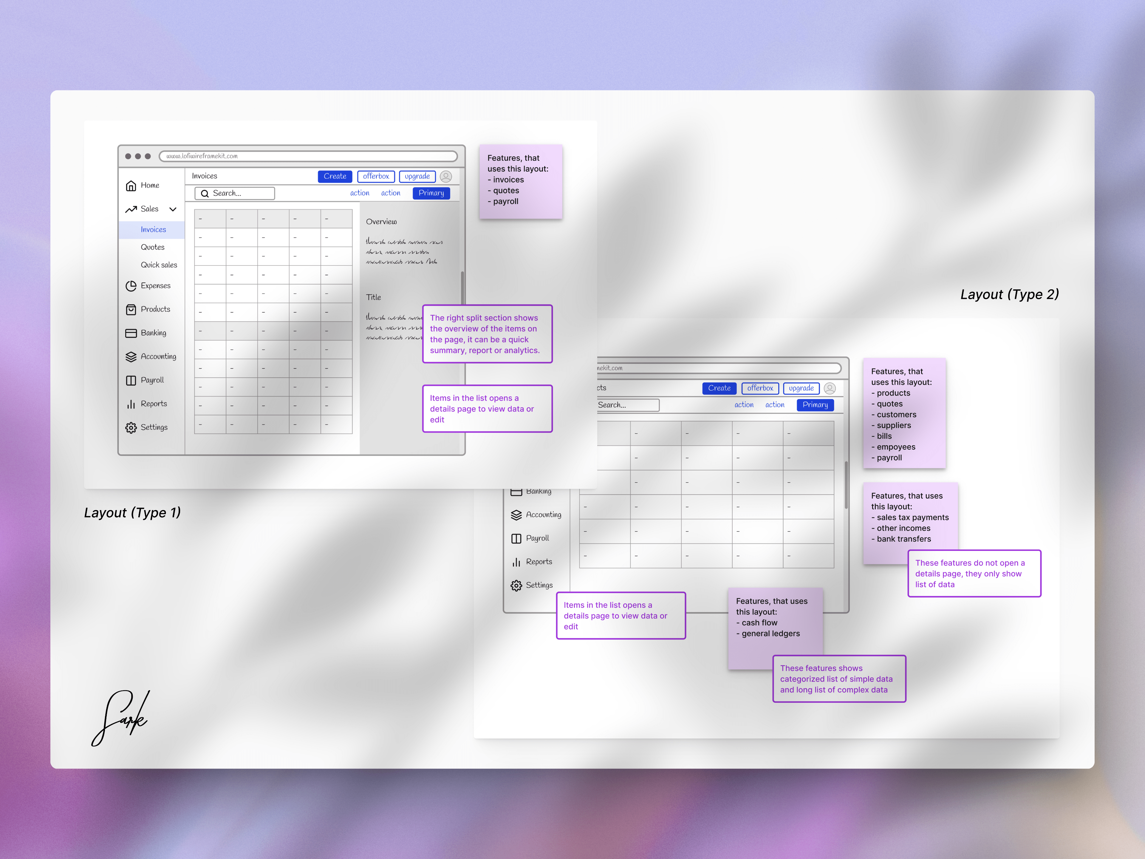
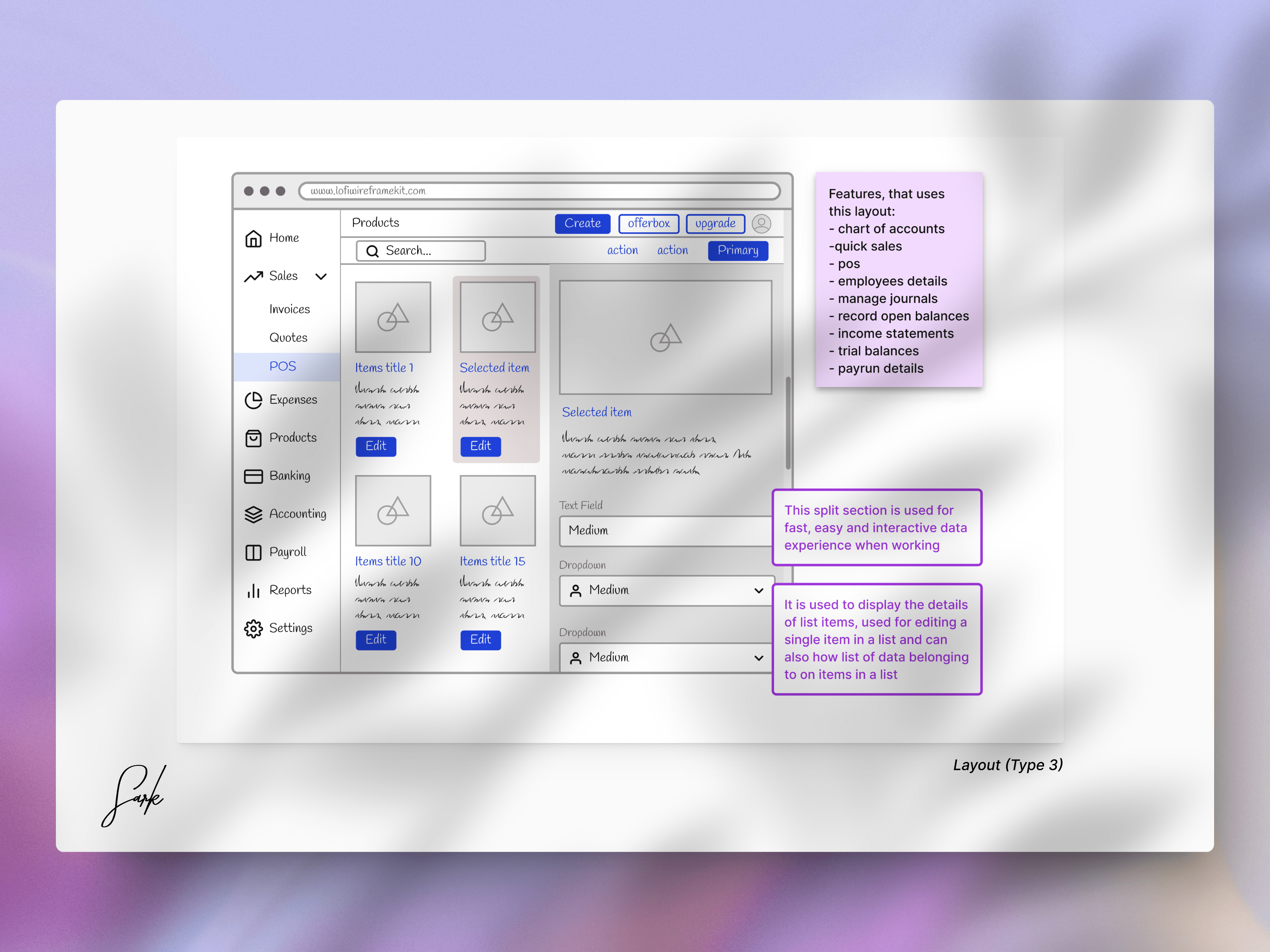
Redesigned a new layout patten to accommodate all the user flow.
To create an intuitive and seamless experience, we reimagined the layout pattern. The new layout was carefully designed to ensure that all key tasks and interactions are easily accessible, regardless of the user’s level of expertise.
The new layout pattern reduced redundancy, enforced consistency in the how tasks are handled and introduced a lot of affordance in the application. This redesign not only enhances usability but also sets a strong foundation for scalable growth, allowing the product to evolve as new features and user needs emerge.
We created a new visual style and branding
As part of the challenges users we encountering, visual design was a major challenge, most of the UI components were completely out of sync and during their MVP, the application was mostly built by technical developers and they used a design system they was hard to customize. This lead to developers using new components for every new use case they met and resulted in more than 3 different that does the same thing and components being used for the wrong things.
To align Built™ with its evolving vision, we developed a fresh visual identity that reflects the brand’s core values. We introduced a modern and cohesive design language with updated color schemes, typography, and iconography. This new visual style not only enhances the overall aesthetic appeal but also creates a more engaging and intuitive experience for users across all touch-points.
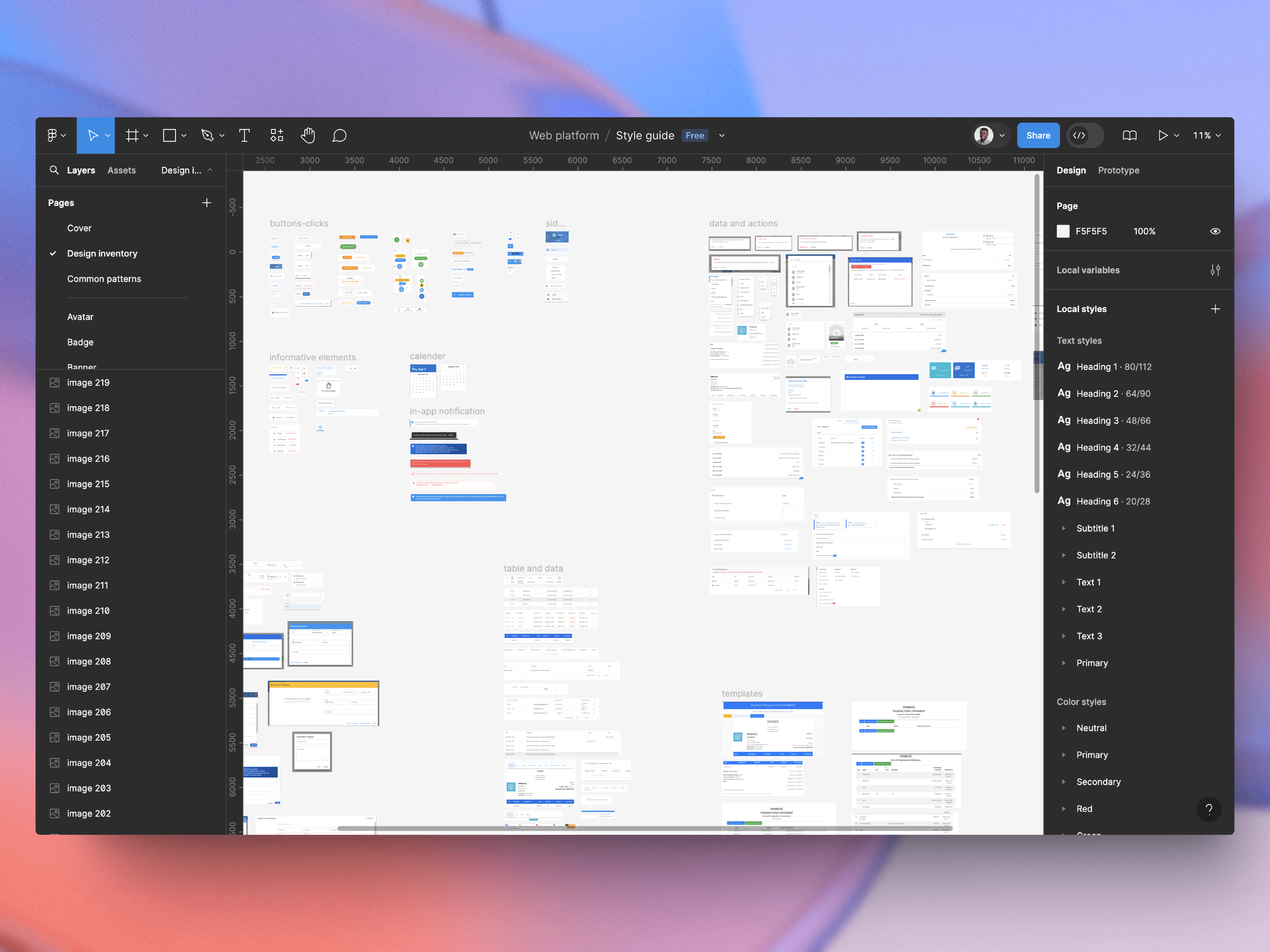
I started by creating an inventory of all the UI components.
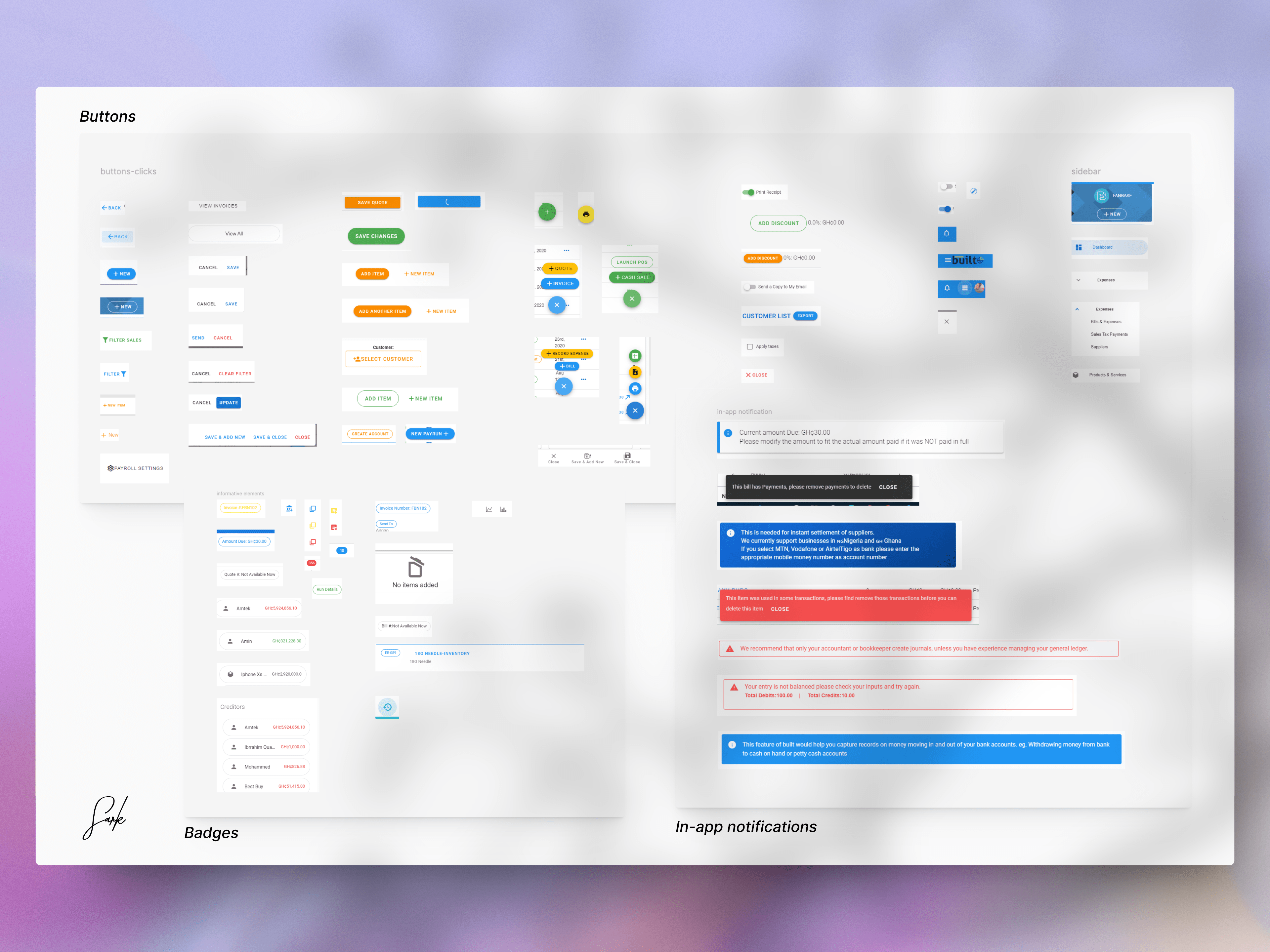
I went on to further, group the components based on functionality and purpose.
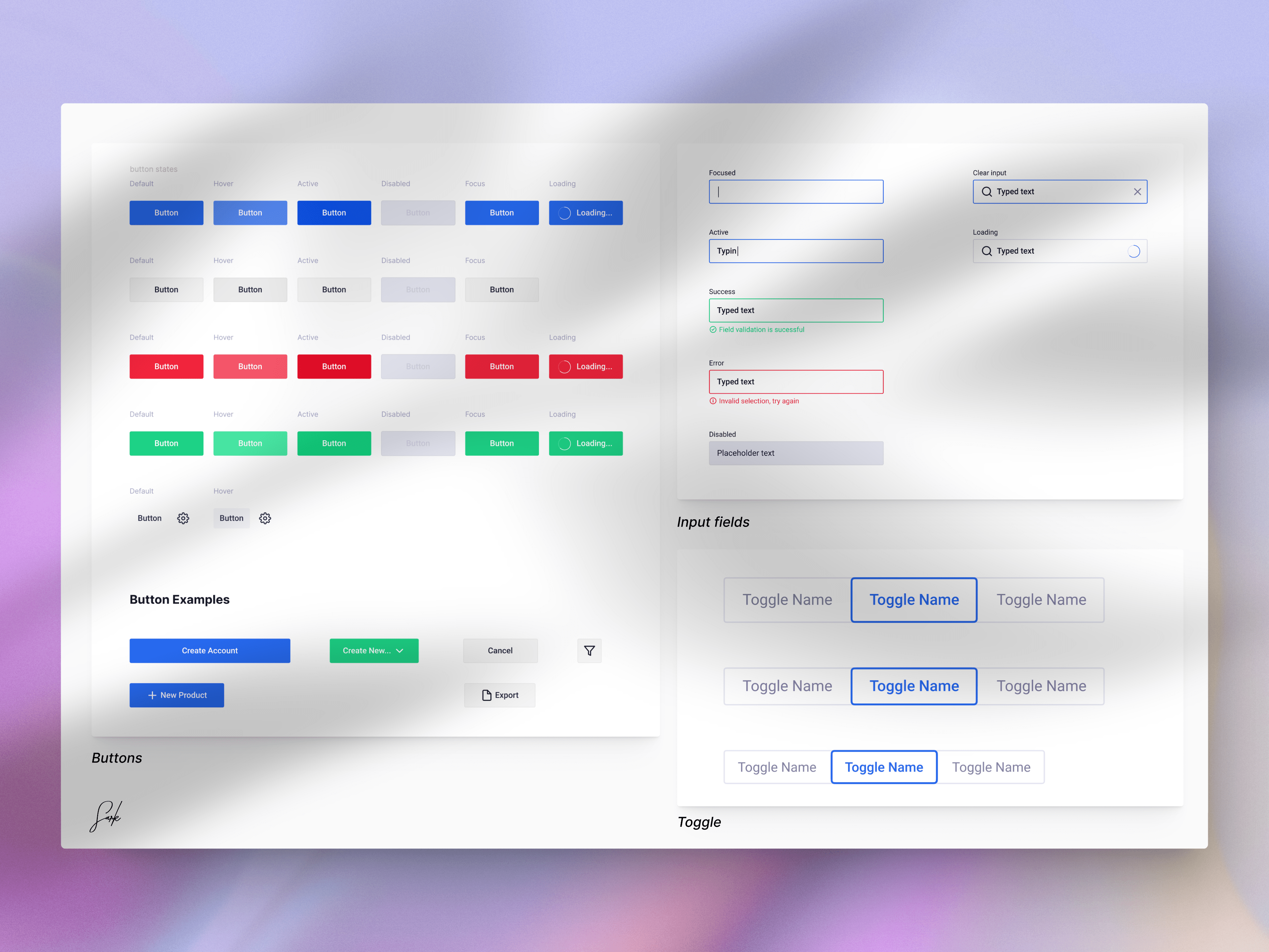
And finally, I designed the new components for each inventory group to ensure that there is consistency and to increase the recognition over recall.
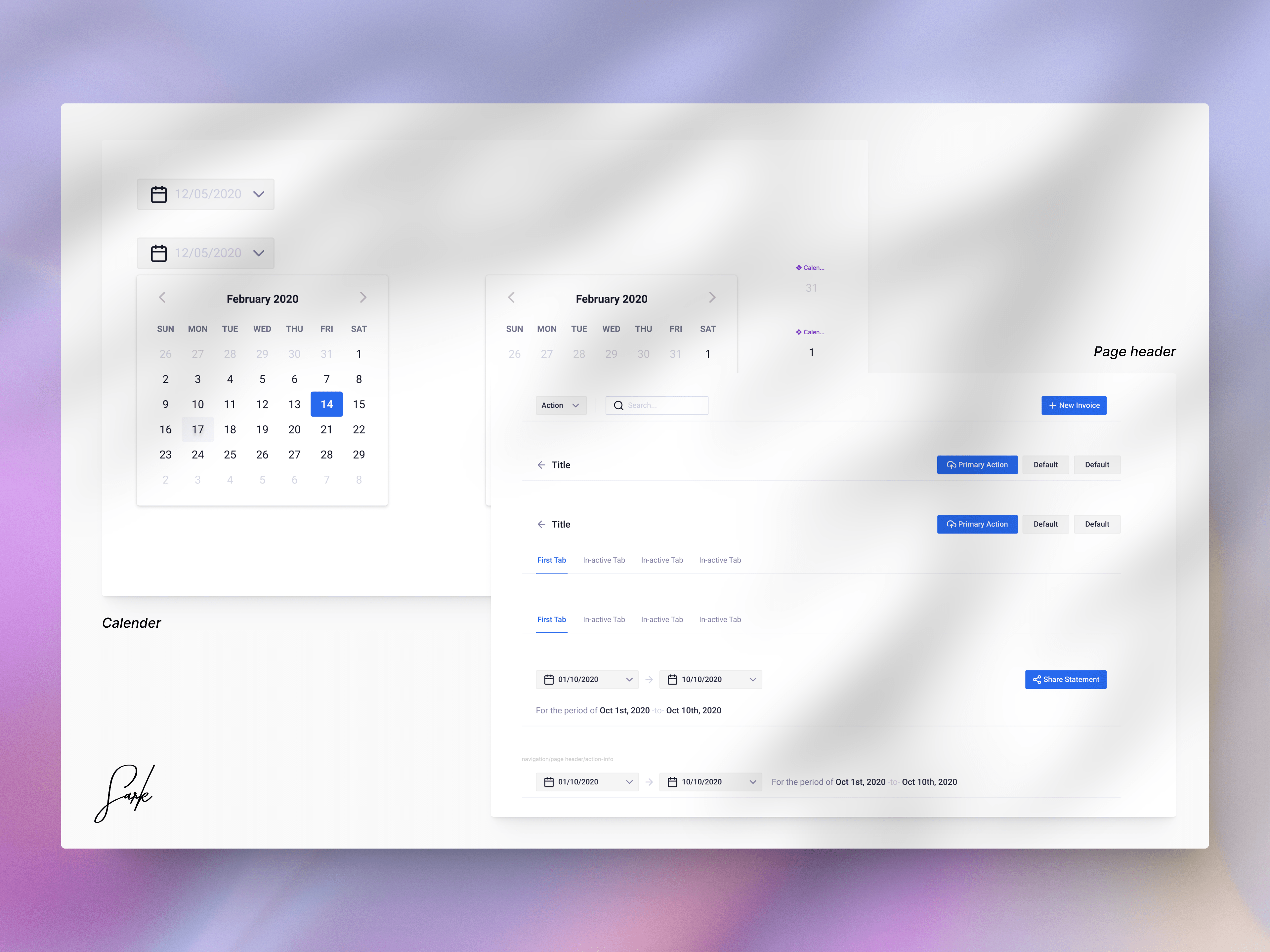
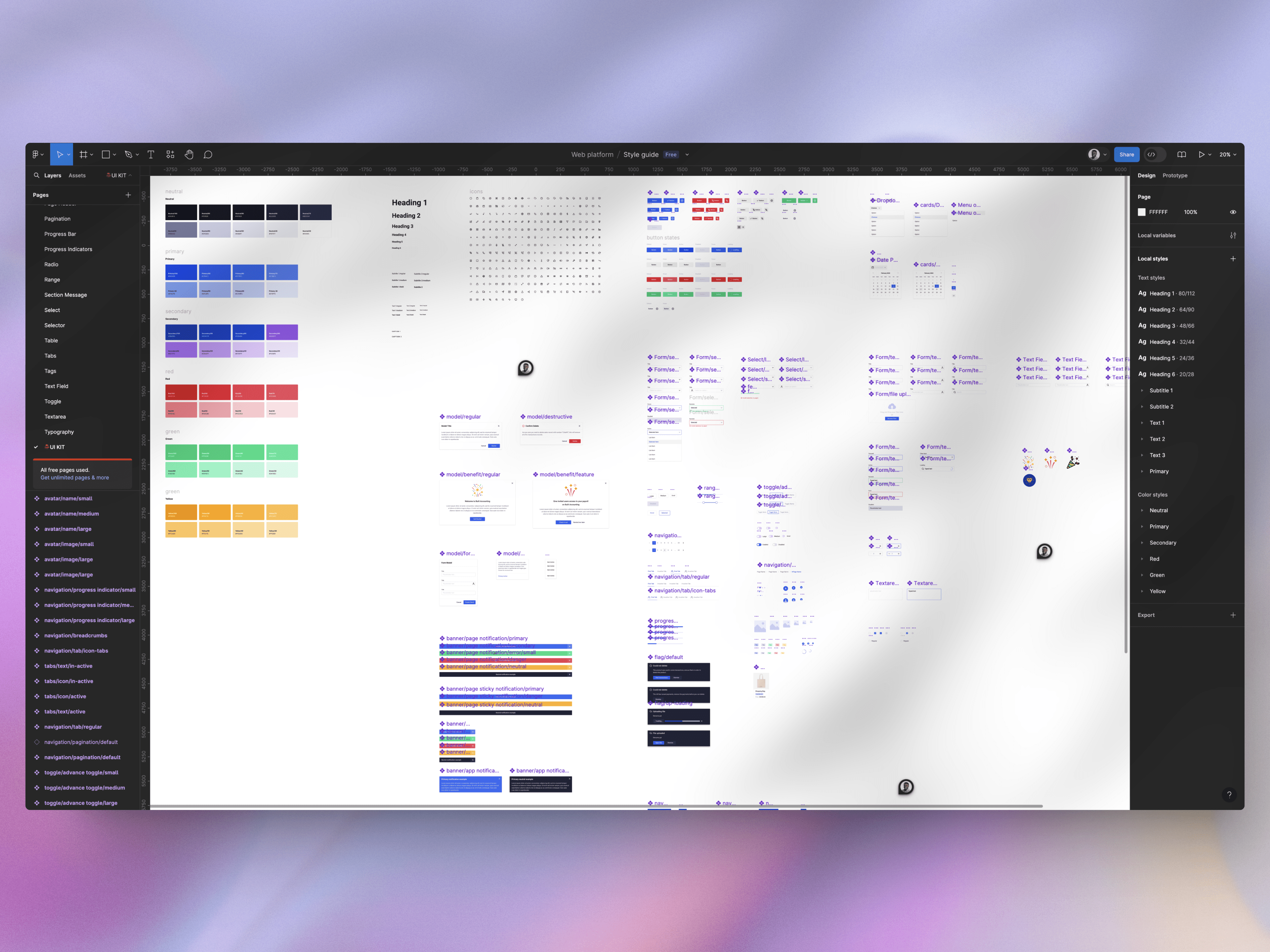
Designed a UI library for their design system
As part of the redesign, we developed a comprehensive UI library to support consistency and efficiency across the product. The library includes reusable components, style guidelines, and design patterns, allowing the team to scale the design effortlessly while maintaining a cohesive user experience. This foundation is key to ensuring that future updates and features remain consistent with the established visual style.
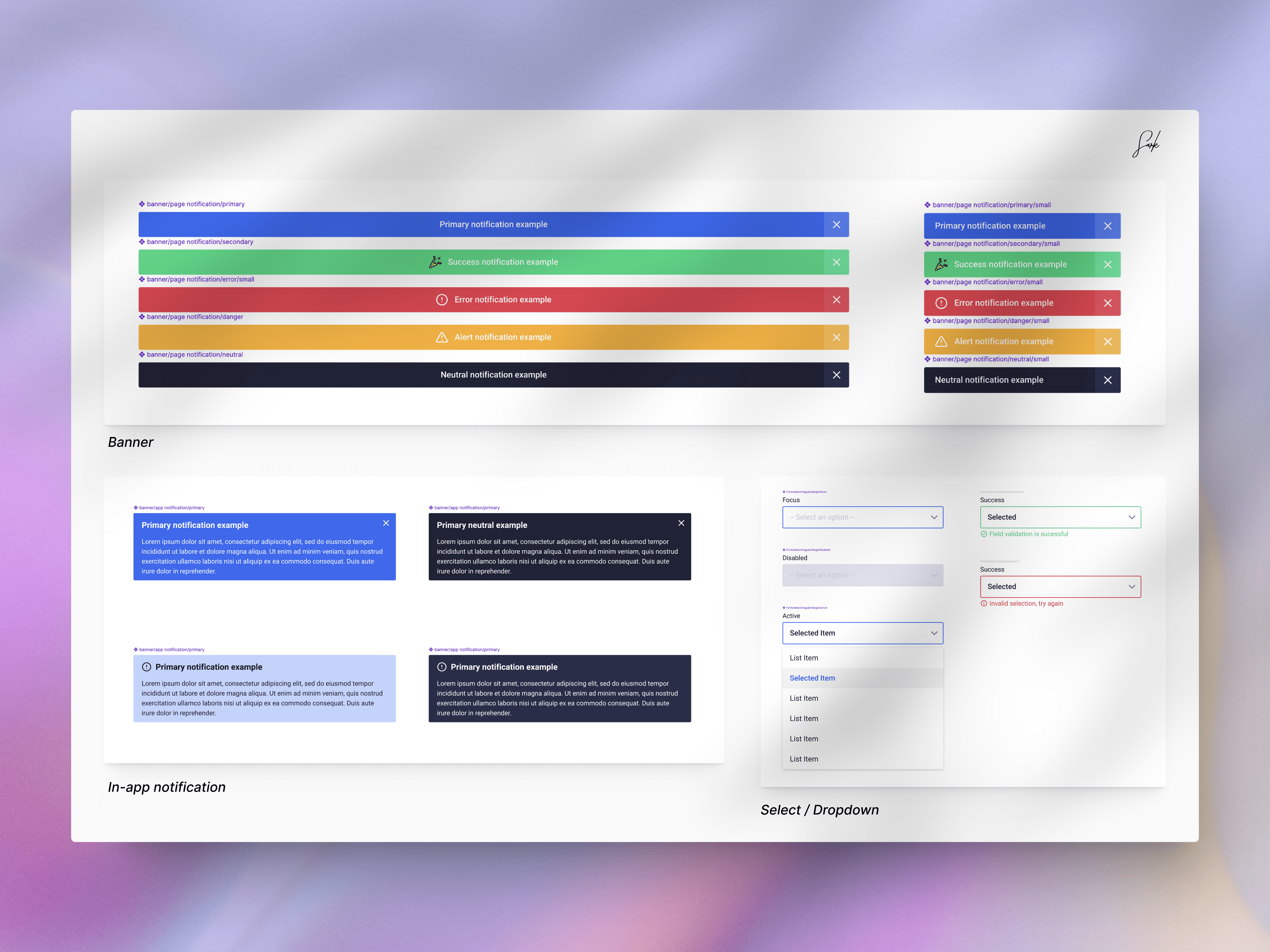
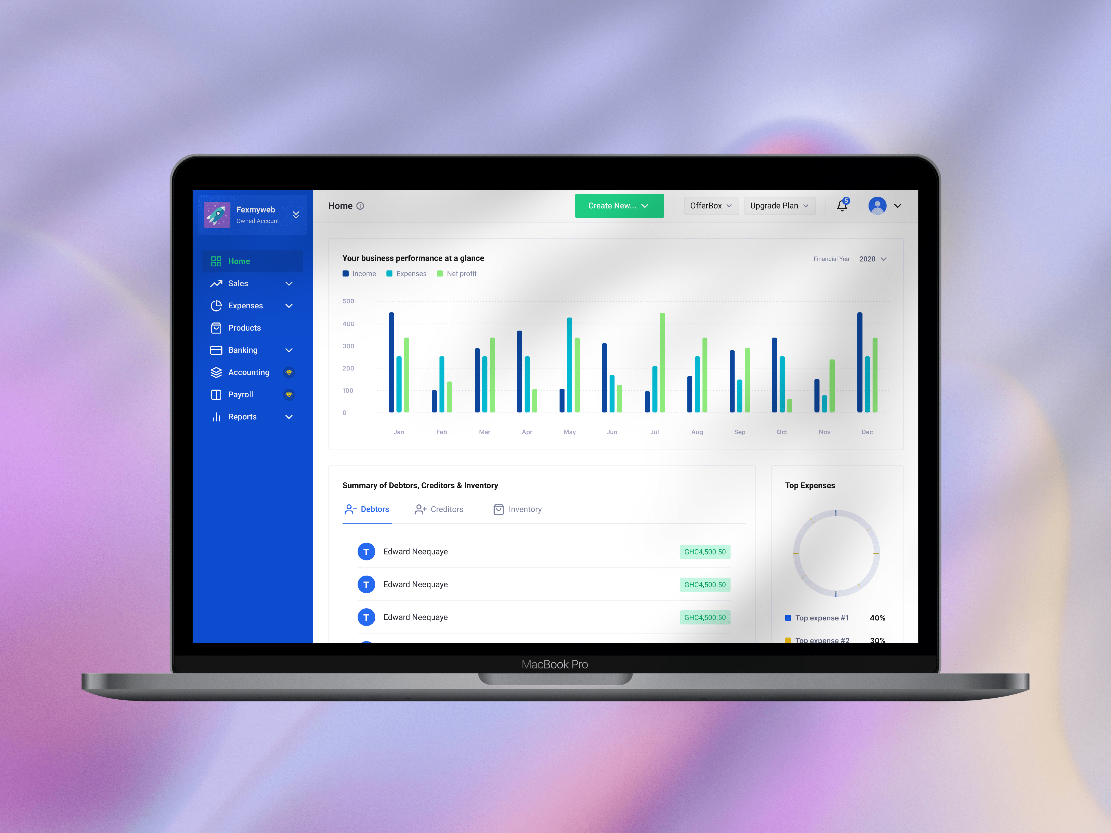
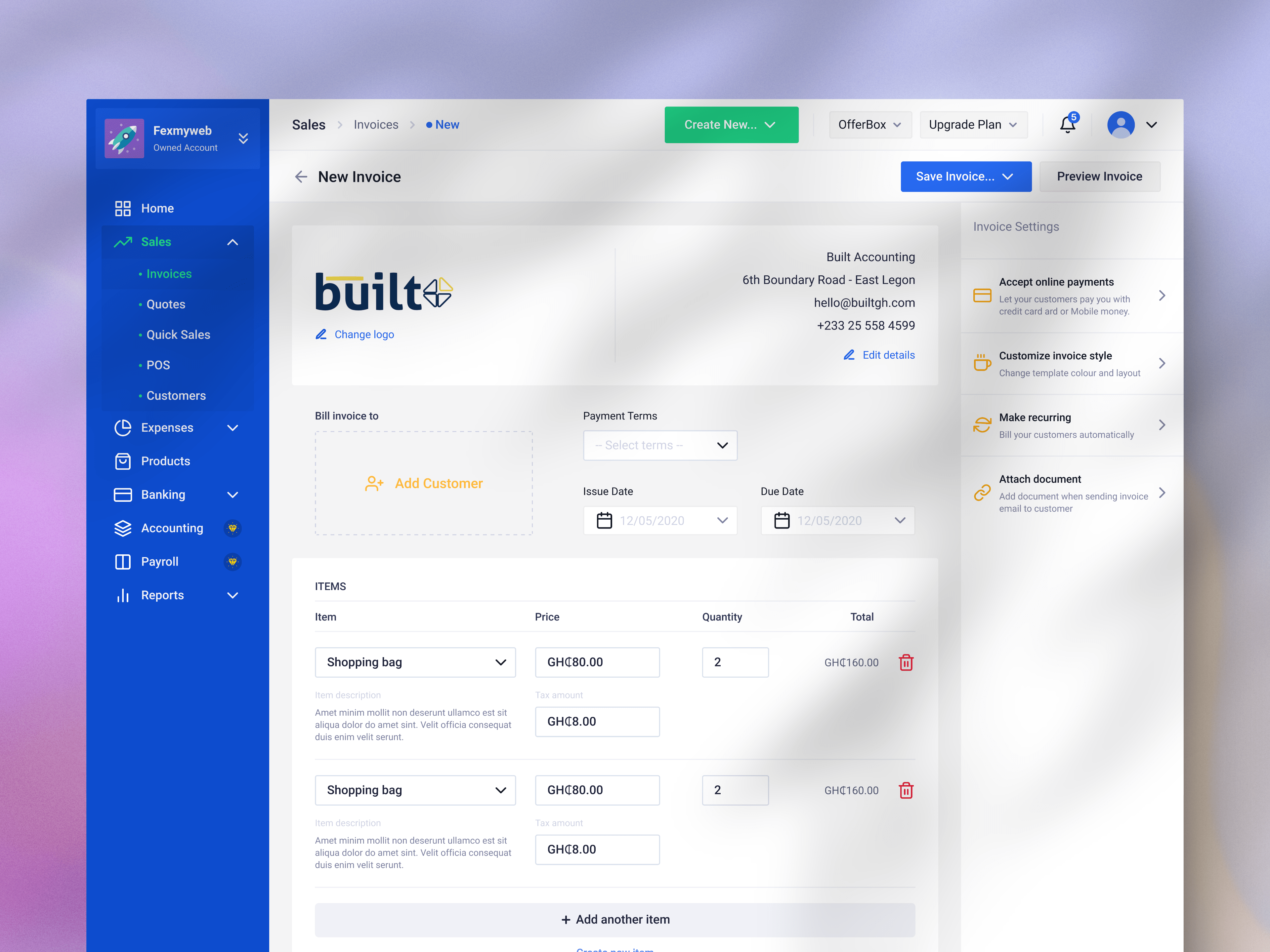
Updated the interface to have a new look
At the end of the project, the application interface was given a complete makeover, resulting in a cleaner and more contemporary look. We streamlined the layout, improved spacing, and refined visual hierarchies to create a more intuitive user experience. This update not only makes the application more visually appealing but also boosts usability by prioritizing clarity and ease of use.

Conclusion and final thoughts
Working on Built™ was a experience and really showcased how much design can transform business and bring user satisfaction. Addressing challenging problems starts with deep understanding. Through our user research and workshops, we gained valuable insights into how users interact with the software. This understanding enabled us to identify straightforward strategies for building and maintaining consistency across various users and use cases.